
Solving problems is nearly impossible when you don’t know where to start. Likewise, building programs and initiatives are even more difficult when you don’t have credible data on which to base your strategy. That’s why it’s always helpful to begin by getting your IT data cleaned up and then visualizing your issues to pinpoint problem areas to attack. But once it’s clean and curated, how do we view our data most effectively to make IT decisions?
Sometimes we put our data into a business intelligence tool like Power BI or Tableau, and that’s a great way to take otherwise confusing, overwhelming or tedious data and reorient it into a more consumable format—like taking an Excel document and turning it into charts and graphs for those immediate “aha!” moments of clarity.
Business intelligence tools are great, but how do I cut down all the tooling?
While we can all appreciate the functionality of business intelligence tools and their power to draw insights, the process of taking data from point A to point B, and then again to point C often draws resources, time and personnel. From data discovery to normalizing this information into a consolidated and contextualized (i.e., useful) format, then combining with relevant prioritization information (like lifecycle management and license compliance), exporting and uploading into another tool (or if possible, a direct API), doing all these processes across more than one space/platform/tool… it can be cumbersome.
Not to say that it doesn’t save you exponentially in terms of resources to leverage business intelligence—just think of the visualization effort required for Excel spreadsheets—but what if you could do all that work from a single interface? From data aggregation to visualization, pinpointing areas of need and opportunity for your organization, all within a single workflow and without the need for additional tooling? Sign me up.
For IT inventory visualization, dashboard options abound
If you’ve used Flexera in the past for your data discovery and normalization efforts, you’ve probably seen some visually appealing charts, but maybe you wanted to drill down in ways that only a tool like Power BI or Tableau could provide. And that’s OK with us—at the end of the day, we want to make your job easier, more efficient and more effective. So if it’s Tableau for your needs, we’re here to support you. However, as we’ve mentioned, making you as efficient and effective as possible is our purpose. So we went ahead and upped our dashboard game.
One flow, see your data and make decisions in real time
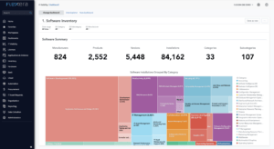
As you can see above, as the industry evolves, so do we—from on-premises to cloud, EC2 to container coverage—Flexera is committed to improving our solutions in line with technology, and that goes along with our customers’ ability to visualize and take action on their data in a user-friendly way.
Flexera provides key industry benchmark dashboards out of the box: software and hardware inventory, end of life and end of support (lifecycle management), sprawl and more. But improving customer visualization also means diving deep into your data, customizing your analytics and creating your own dashboards.
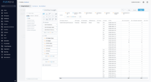
Via Data Explorer in Flexera One’s IT Visibility solution, harness the power of Technopedia—including 4.6 million+ products, 250 million+ data points and 4,500+ daily updates—to drag and drop categories, contextualization and enrichment over your IT asset inventory.
Whether you want to contextualize your inventory by business service, business unit, cost center or location, or measure the number of devices, installs, models or products, Flexera One provides boundless opportunity to build out data visualizations that make sense for your individual, organizational and strategic needs. As you create insights, the analytics engine offers recommended next steps, like adding trends or comparisons for the data.
Need your data in a scatter plot, a geo chart, a heat or tree map? Want to create a dashboard with several charts to share with your team or leadership? We’ve got you covered.
IT Visibility can be configured to ingest data from virtually any data source and supports the most-used sources, like Microsoft System Center Configuration Manager (SCCM), HP Universal Discovery (HPUD), Service Now Discovery and others right off the bat. Once your data is ingested into IT Visibility, visualizing is as simple as clicking a button—drawing insights is just as simple, with preset dashboards for industry standards, like software or hardware inventory, sprawl, lifecycle and more.
Set alerts for action when your metrics change and create views into your data that make sense for your use cases, whether that be end-of-life and end-of-support products, rationalizing your application portfolio or reporting up into management and leadership.
Want to see our IT Visibility dashboards for yourself? Reach out for a demo.