Raw data is pretty much meaningless until you can actually see what’s happening. A bunch of numbers in a table is just noise. To get any insight, you need to turn that data into something you can see and interact with through data visualization. There are a few ways to do just that. You can build static charts, spreadsheets, fixed PDFs…or interactive dashboards. Of these, interactive dashboards are by far the most useful for real analysis.
Static reports answer the questions you thought to ask. Interactive dashboards help you find the ones you stumble upon along the way. You can filter, dig deeper and look at things from different angles whenever you want. No need to go back to an analyst, open a ticket or wait for a new data export. The data just gives you the answers you are looking for. As Databricks states, highly interactive visual analytics is now table stakes for any serious analysis.
Databricks users now have AI/BI dashboards to fill this very gap. The legacy dashboards (previously referred to as Databricks SQL dashboards) are officially the end of life (EOL). They are no longer accessible. The new dashboards are a major revamp, built from the ground up with a completely new architecture. The legacy dashboards ran each chart as a separate query, with no cross-filtering or multi page support and no way for one chart to react to another. Databricks AI/BI dashboards replace all that. They give you a free-form canvas and shared datasets powering multiple charts at once. Everything can update in sync, so you can filter, cross-filter and even drill-through navigation to other pages. Plus, they have added some great new features like AI-assisted authoring and built-in forecasting and so much more. It’s not just a simple upgrade; it’s a whole new product.
In this article, we will cover everything we need to build interactive data visualizations in Databricks AI/BI dashboards: what it is, how it works, its capabilities and limits and a full step-by-step guide to creating a dashboard from scratch. Let’s dive right in!
Databricks AI/BI 101
Databricks AI/BI is a business intelligence (BI) product suite built directly into the Databricks Data Intelligence Platform. It blends low-code dashboards with a conversational AI interface, so both technical and non-technical folks can work with the same data without switching tools.
Databricks AI/BI does not rely on just one single, monolithic AI model. It is powered by a compound AI system. It utilizes a team of AI agents that work together. Each specializes in narrow tasks like SQL generation, intent detection or data visualization. Together they understand the semantic context of your organization’s data, ETL pipelines and query history. And because it is embedded in the same environment where your data lives, there are no extracts, no shadow warehouses and no sync delays.
Databricks AI/BI has two core offerings:
- Databricks AI/BI dashboards
- Databricks AI/BI Genie / Databricks Genie spaces
This article focuses exclusively on Databricks AI/BI dashboards.
What is a Databricks AI/BI dashboard?
A Databricks AI/BI dashboard is an interactive business intelligence dashboard and visualization layer built directly in Databricks. It gives you a dashboard canvas where you place charts, filters and text widgets to build interactive and multi page report; everything backed by live SQL queries on your Databricks data.
The Databricks AI/BI dashboard interface is split into two authoring surfaces:
> Data tab
The Data tab is the backend where you model your datasets. Each dataset is a SQL query against one or more tables or views. You can write queries manually, pull a Databricks Unity Catalog table or view directly or let Genie Code generate them from a natural language prompt.
> Canvas tab
The Canvas tab provides a grid-based dashboard canvas for building the visible report. You drag and drop visualizations onto a free-form grid. On top of that, you can even add one or more pages to the dashboard (multi page reports are supported), then place Databricks widgets on each page. Databricks Widgets can be charts (bar chart, line chart, pie chart, area chart, scatter chart, Sankey, box plot, histogram, heatmap and more), pivot tables, text boxes, counters, filters and more. You click on a widget to configure it using a side panel, choosing fields, aggregation and styles. All Databricks widgets update interactively against the datasets you defined.
A new dashboard starts with one blank page titled Untitled page. You can add, rename, clone or delete pages. All edits are saved as a draft until you are ready to publish and share your findings.
Why use Databricks AI/BI dashboards?
Databricks AI/BI dashboards combine BI and AI to make analytics faster and easier. We can build and share powerful dashboards and reports without switching between separate BI tools. Here are the main reasons we use them:
Fast, live analysis. Databricks AI/BI dashboards run on live data with built-in caching and query optimization. Large dataset interactions stay responsive. All data access is governed by Databricks Unity Catalog permissions, keeping your information secure.
AI-powered. You, as a user, can describe the chart you want in plain English, and Databricks AI/BI dashboards will automatically generate the SQL and visuals (using the built-in Databricks Genie). This allows you to build complex charts without writing SQL and ask follow-up questions in simple, natural language.
Interactive filtering and cross-filtering. Every dashboard can include filter Databricks widgets: dropdowns, multi-selects, date pickers, range sliders and more. Cross-filtering goes further. Click on a data point in one chart and every other visualization on the same page that uses the same dataset updates instantly. An active filter bar at the top of the page shows all currently applied selections.
Drill-through navigation. You can link pages for layered reporting. Right-click a data point and choose “Drill to…” to jump to a target page where filters are pre-populated with your selection. If the target page has visualizations based on the same dataset as the source, they filter automatically without any explicit target filter configuration.
Multi page reporting. Databricks AI/BI dashboards support organizing content across multiple pages. Long reports break into sections, and viewers can navigate without endless scrolling. Up to 15 pages are supported per dashboard.
Governed access. Databricks AI/BI dashboards always respect Databricks Unity Catalog permissions. Row-level and column-level security on your tables flows through to every chart on the dashboard canvas.
Rich visualization library. Databricks AI/BI dashboards support all the standard visuals like bar chart, line chart, area chart, scatter chart, pie chart, donut chart, box plots, histograms, heatmaps, Sankey charts, funnels, waterfall charts, cohort charts, bubble charts, combo charts, counters (with sparklines), pivot tables, detail tables, point maps, choropleth maps and more. Every visual offer direct UI control for axes, colors, labels, legends, number formats, conditional formatting and more.
Brand theme and locale. Databricks AI/BI dashboards can be customized to match your corporate look and feel. Databricks Workspace admins can set a default theme (colors, fonts, background) at the account level. All new dashboards inherit it. Authors can override or change themes and specify a locale for date and number formatting.
Shared publishing + embedding. Databricks AI/BI dashboards can be shared across the entire Databricks account. Once published, a dashboard can be shared with anyone registered to your Databricks account, even without workspace access. You can also embed dashboards in external apps using iframes and secure tokens as part of a broader embedded analytics strategy. Dashboards published with a linked Databricks Genie space expose the “Ask Genie” button even in basic embedded contexts.
Automation and version control. Databricks treat AI/BI dashboards like code. You can export and import dashboard definitions as .lvdash.json files, store them in Git via Databricks Git folders and update them via the Databricks REST API or Declarative Automation Bundles. CI/CD pipelines and source control are both supported.
No extra license is needed. Databricks AI/BI dashboards are included with Databricks SQL. There are no separate per-user BI licenses. Viewers with the Consumer access entitlement can access published dashboards without the full Databricks SQL entitlement. You only pay for compute and storage.
Databricks AI/BI dashboards—core features and capabilities
Let us now deep dive into key features of Databricks AI/BI dashboards:
1) AI-assisted visualization creation
Databricks AI/BI dashboards let you describe the chart you want in plain English and automatically generate it. It is powered by the Genie Code. This feature speeds up dashboard building for non-technical users. You can then refine the chart manually with point-and-click edits.
2) Wide range of visualization types
Databricks AI/BI dashboards’ data visualization library is very massive. You get all the usual charts (bar chart, line chart, pie chart, area chart, scatter chart) plus advanced options like maps, heatmaps, funnel charts, cohort charts, Sankey charts and so much more. Pivot tables and tabular views are also supported for multi-dimensional summaries.
3) Dynamic filtering and interactivity
Databricks AI/BI dashboards offer rich dynamic filtering and drill-down capabilities. You can define global filters (across all pages), page-level filters and individual widget filters. Clicking on one chart can cross-filter the others (so all visuals stay coordinated) and drill-through lets you click a value to see detailed data.
4) Custom calculations and level-of-detail expressions
You can perform on-the-fly data transformations without altering source tables. AI/BI dashboards support calculated fields and level-of-detail (LOD) expressions. That means you can define new metrics or aggregations directly in the dashboard.
5) Built-in conversational analytics (Databricks Genie)
Every dashboard comes with Databricks Genie. With Genie, business users can type questions in natural language and get instant answers or visualizations. Behind the scenes, Genie uses Databricks Unity Catalog metadata and any business-specific synonyms you have defined to understand questions.
6) Flexible data sources and datasets
Databricks AI/BI dashboards can use any data in your Databricks Workspace. Create a dataset by writing SQL against a Unity Catalog table or view, by picking a table directly from the catalog browser or by uploading a CSV, Excel or TSV file directly into Databricks Unity Catalog from the Data tab. Datasets can include JOINs, filters and aggregations. You can also export a dataset to a Unity Catalog materialized view for better refresh performance.
7) Automated refresh and subscriptions
You can set a refresh schedule on any published dashboard. You can also subscribe yourself or others to a dashboard. Databricks sends a snapshot via email, Slack Microsoft Teams or any other configured platforms when data updates.
8) Secure sharing and embedding
Once a Databricks AI/BI dashboard is fully ready, it can be published and shared broadly. You choose whether to publish with shared data permissions (the viewer gets the publisher’s access level) or individual permissions (each viewer needs their own data access). You can share at the workspace level or even the entire account (so anyone in your organization can see it). Plus, dashboards support embedded analytics. You can grab an iframe code for a published dashboard and drop it into any web app or portal.
9) Collaboration, versioning and automation
The Databricks AI/BI dashboard workspace is built for team workflows. Authors can share and co-edit dashboards in Databricks. For version control, dashboards stored in a Databricks Git folder are serialized as .lvdash.json files and tracked like code: commit history, branches and pull request workflows all work. Dashboards can also be managed programmatically via the Dashboards API (Lakeview REST API) or included in Databricks Asset Bundles for infrastructure-as-code deployments. Note that the maximum is 100 dashboards per Git folder, and the JSON format produces verbose diffs that are hard to review in pull requests.
10) High performance and scalability
Databricks AI/BI dashboards scale to large data volumes. Client-side caching handles datasets under 100 MB and 100k rows in the browser for near-instant updates. Larger datasets benefit from server-side query optimization and incremental loading. You can also pre-warm the cache using scheduled refreshes on published dashboards.
11) Custom theming and responsive layouts
Databricks AI/BI dashboards are not stuck with the default look. Authors can configure color palettes, font styles and light/dark mode. Databricks Workspace admins can set a default theme at the account level. All new dashboards inherit it. Dashboards also adapt automatically to smaller screens: on a phone or tablet, Databricks One switches to a single-column mobile-friendly layout with no configuration required.
12) Multi page dashboards and content organization
Databricks AI/BI dashboards can span multiple pages or tabs. You are not limited to one dashboard canvas; the latest release supports up to 15 pages per dashboard. Authors can clone or reorder pages and even copy widgets between dashboards.
13) Governance and auditing
Finally, Databricks AI/BI dashboards inherit Databricks Unity Catalog data permissions and lineage. All usage is logged too; Databricks tracks who views or edits dashboards in audit logs and system tables. We can use these logs to monitor adoption (which dashboards are most viewed) or for compliance reporting.
How Databricks AI/BI dashboards differ from legacy Databricks SQL dashboards?
Databricks AI/BI dashboards are a complete revamp of Databricks reporting. The legacy Databricks SQL dashboards were simple tools designed to create charts directly from Databricks Notebooks. They allowed users to build and refine dashboards alongside their data workflows. However, their functionality was limited to basic charting and minimal filtering; nothing close to the modern analytics capabilities available today.
Databricks AI/BI dashboards, on the other hand, offer a next-gen experience.
🔮 Modern UI and AI ⇒ The legacy Databricks SQL dashboard interface was fairly basic. Databricks AI/BI dashboards feature a modern drag-and-drop UI, including tools like Genie Code for natural-language chart creation. Users can now prompt the system instead of manually building every chart.
🔮 Integrated intelligence ⇒ Old legacy dashboards had no built-in forecasting or conversational query help. AI/BI dashboards include a one-click AI forecast on line charts (powered by Databricks’ AI_FORECAST() function) and Databricks Genie integration directly into the dashboard.
🔮 Cross-filtering and drill-through ⇒ Databricks AI/BI dashboards allow users to click on charts to filter others and use right-click navigation between pages. Legacy Databricks SQL dashboards only supported simple parameters or linked charts and did not offer automatic cross-filtering or drill-through capabilities.
🔮 Governance ⇒ Legacy Databricks SQL dashboards were not integrated with Databricks Unity Catalog, resulting in looser security. Databricks AI/BI dashboards, however, ideally use Unity Catalog for all data sources, ensuring dashboards respect fine-grained permissions for tables, views and metric views.
🔮 End-of-life (EOL) ⇒ Legacy dashboards are officially gone. Databricks officially ended support for legacy Databricks SQL dashboards in early 2026. New workspaces no longer include the old dashboards, and existing users are encouraged to migrate or clone their old dashboards into the new Databricks AI/BI dashboards.
So, if you are using the Databricks platform today, AI/BI dashboards are the supported solution for creating interactive BI dashboards and reports. The Legacy Databricks SQL dashboards have been fully deprecated.
How to create an interactive data visualization in Databricks AI/BI dashboards?
Now let’s build a dashboard from scratch. We will use a simple data model with tables for students, courses, enrollments and grades. You can follow along using any Databricks Workspace with SQL access. If you already have a dataset, skip to step 7.
Prerequisites and setups:
To follow this tutorial, you need:
- Databricks SQL entitlement. Databricks AI/BI dashboards require the Databricks SQL access entitlement on your user account. If you can open the SQL editor and run a query, you have it. If not, a workspace admin can grant it under Settings > Identity and access > Users or Groups > Entitlements
- A running Databricks SQL warehouse. Dashboards execute every query through a Databricks SQL warehouse. Both Pro and Serverless warehouse types work; Serverless is the better choice for lower query latency and faster cold starts. You need at least CAN USE permission on the warehouse. Shared warehouses also work, but they have query concurrency limits
- Databricks Unity Catalog (recommended). Unity Catalog is not strictly required, but it is the right governance layer for anything beyond personal experimentation. You need at least SELECT privilege on any table or view you plan to use. Without it, the dashboard editor will not let you reference those objects as datasets
- Demo dataset to use. In our example, we will create some demo tables below. If you already have data, you can write SQL to define your dataset instead
- Account-level identity setup (for external sharing). If you want to share a published dashboard with users who do not have workspace access (account-level users) confirm that account-level user federation is configured
Note that Databricks AI/BI dashboards do not require a separate BI license for viewers, but viewers do need proper compute and data permissions to run the underlying queries.
With that, let’s build.
Step 1—Log in to Databricks and confirm your entitlement
First, sign in to your Databricks Workspace and confirm that your user has the Databricks SQL access entitlement. The Databricks SQL access entitlement grants access to SQL features such as dashboards, queries and SQL warehouses, and it is the entitlement used for creating dashboards. If you are not sure, ask a workspace admin to check your entitlements under Settings > Identity and access > Users > [your account] > Entitlements. The entitlement you need is listed as “Databricks SQL access.”
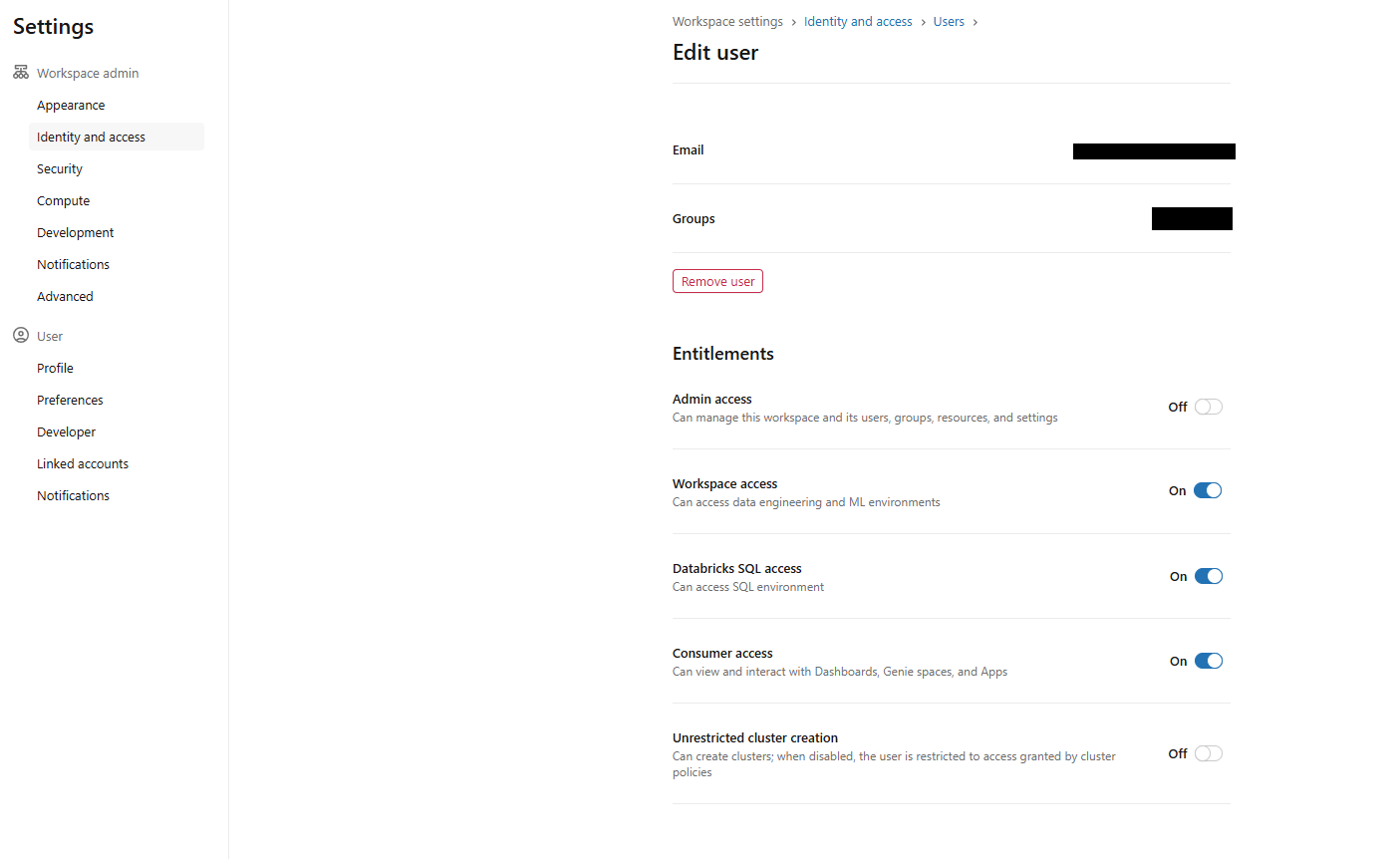
Figure 1: Workspace settings showing the SQL access entitlement check—Databricks AI/BI dashboards
Make sure you can see the sidebar with SQL Warehouses or SQL endpoints.
Now create or start your Databricks SQL warehouse; you need at least CAN USE access on one warehouse for running queries. Once you are in, we are ready to create a dashboard.
Step 2—Open Databricks AI/BI Dashboard section
In the workspace sidebar, click Dashboards (or use the New > Dashboard menu). It takes you to the Dashboards page, where you will see all the dashboards you can access, sorted by when they were last updated and who owns them. You can also search for dashboards by name, page, widget title, dataset or query.
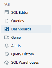
Figure 2: The dashboards listing page in the workspace sidebar—Databricks AI/BI dashboards
You can also create dashboards from the workspace browser or the + New menu in the sidebar, but starting from the Dashboards listing page keeps things straightforward.
Step 3—Create and name your AI/BI dashboard, then select a warehouse
Create a new dashboard from the sidebar by selecting + New > Dashboard.
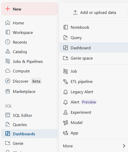
Figure 3: The new dashboard button in the workspace sidebar—Databricks AI/BI dashboards
Or create it from the Dashboards listing page with Create dashboard.
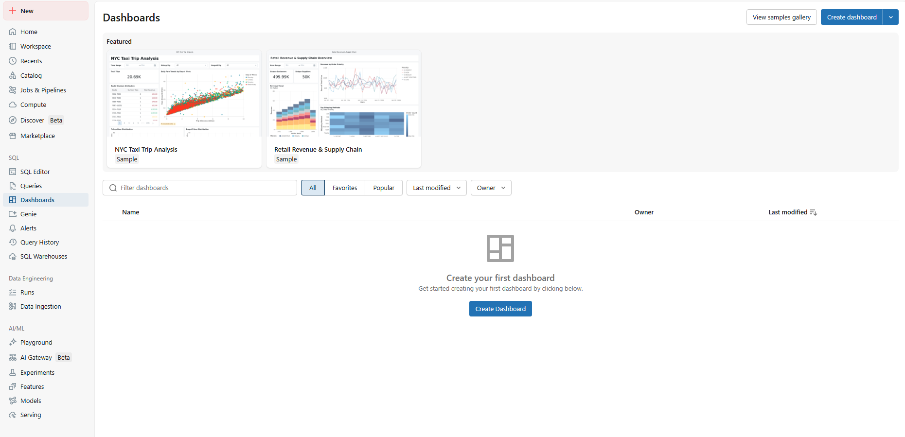
Figure 4: Creating a new dashboard from the listing page—Databricks AI/BI dashboards
Databricks opens the new dashboard in draft (edit) mode and auto-names it with a creation timestamp. It’s stored at /Workspace/Users/<username> by default. Rename it to something meaningful (such as Student Grades Dashboard).
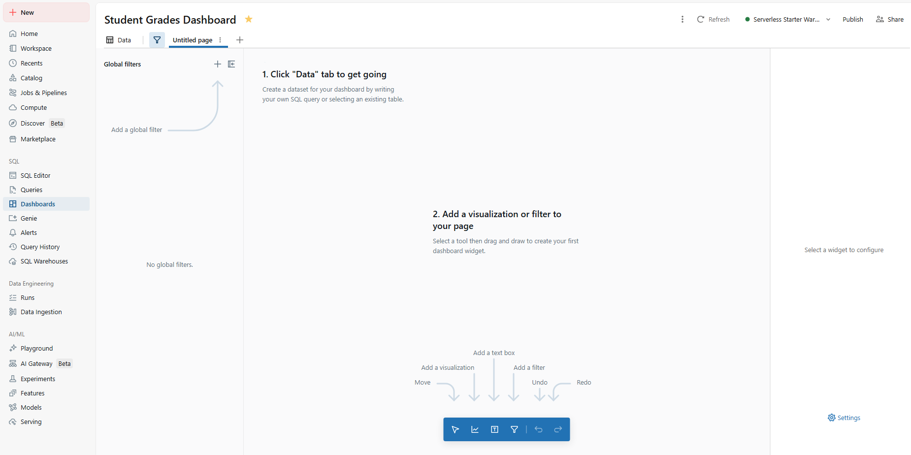
Figure 5: Databricks AI/BI Dashboard interface
Next, select your SQL warehouse. Databricks auto-selects the workspace default warehouse, but you can switch to any warehouse you have CAN USE access on. The warehouse picker appears in the top toolbar. Make this selection before you run any datasets.
Note: Every change you make in the dashboard editor is auto saved to the draft. The draft and the published version are independent. Viewers always see the latest version. Nothing you do in the draft reaches viewers until you explicitly click Publish.
Step 4—Understand the canvas vs data tabs
At the top you will see two main tabs: Data and Canvas.
The Data tab is where you define datasets. A dataset is a named SQL query or a reference to a Unity Catalog table or view. Datasets power your visualizations. You can have multiple datasets in a single dashboard, and one visualization can only use one dataset at a time.
The Canvas tab is where you build the visual layout. It is a drag-and-drop grid – the dashboard canvas. You add widgets (visualizations, filters, text blocks and images) and arrange them freely. Dashboards support multiple pages; think of each page as a tab. Page-level filters apply only to that page. Global filters (placed in the global filter panel, accessed via the filter icon in the toolbar) apply across all pages.
At this point, we have a blank canvas. Let’s give it some data.
Step 5—Create the sample tables
We will build four tables: students, courses, enrollments and grades. If you already have data, skip to step 7.
On the Data tab, click Create from SQL. As you can see, this opens the SQL editor where you define the query backing the dataset.
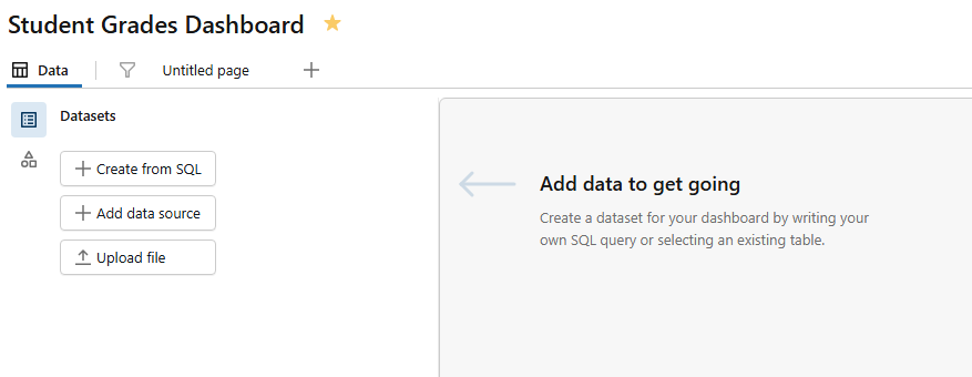
Figure 6: Databricks AI/BI dashboards’ data tab—Databricks AI/BI dashboards
Here you can write any SELECT query against your data source.
But first, open the SQL Editor from the sidebar (not the dashboard editor). Make sure it is connected to your SQL warehouse.
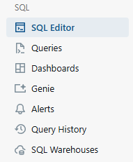
Figure 7: Databricks Workspace sidebar highlighting the SQL editor—Databricks AI/BI dashboards
Run each block below separately or paste all four blocks and run them together.
1) Students table
CREATE OR REPLACE TABLE students (

    student_id      INT,

    student_name    STRING,

    department      STRING,

    enrollment_year INT

);

INSERT INTO students

    (student_id, student_name, department, enrollment_year)

VALUES

    (1,  'Elon Musk',        'Computer Science', 2021),

    (2,  'Jeff Bezos',       'Computer Science', 2020),

    (3,  'Bill Gates',       'Mathematics',      2020),

    (4,  'Mark Zuckerberg',  'Computer Science', 2022),

    (5,  'Warren Buffett',   'Mathematics',      2021),

    (6,  'Larry Ellison',    'Physics',          2020),

    (7,  'Steve Ballmer',    'Computer Science', 2023),

    (8,  'Larry Page',       'Computer Science', 2021),

    (9,  'Sergey Brin',      'Mathematics',      2022),

    (10, 'Michael Bloomberg','Physics',          2020),

    (11, 'Carlos Slim',      'Mathematics',      2021),

    (12, 'Bernard Arnault',  'Physics',          2022),

    (13, 'Mukesh Ambani',    'Physics',          2021),

    (14, 'Gautam Adani',     'Computer Science', 2023),

    (15, 'Jensen Huang',     'Computer Science', 2022),

    (16, 'Michael Dell',     'Mathematics',      2023),

    (17, 'Phil Knight',      'Physics',          2021),

    (18, 'Zhong Shanshan',   'Computer Science', 2022),

    (19, 'Rob Walton',       'Mathematics',      2020),

    (20, 'Jim Walton',       'Physics',          2023);
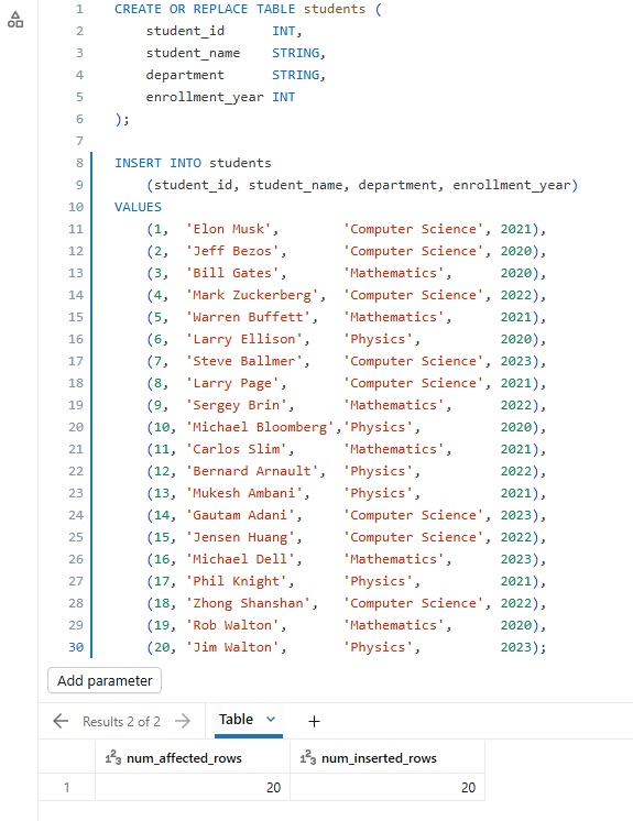
Figure 8: Executing the students table creation script—Databricks AI/BI dashboards
2) Courses table
CREATE OR REPLACE TABLE courses (

    course_id   INT,

    course_name STRING,

    department  STRING,

    credits     INT

);

INSERT INTO courses

    (course_id, course_name, department, credits)

VALUES

    (101, 'Intro to Programming',  'Computer Science', 3),

    (102, 'Data Structures',       'Computer Science', 4),

    (107, 'Algorithms',            'Computer Science', 4),

    (110, 'Machine Learning',      'Computer Science', 4),

    (103, 'Calculus I',            'Mathematics',      3),

    (104, 'Linear Algebra',        'Mathematics',      4),

    (108, 'Statistics',            'Mathematics',      3),

    (111, 'Discrete Mathematics',  'Mathematics',      3),

    (105, 'Classical Mechanics',   'Physics',          3),

    (106, 'Quantum Mechanics',     'Physics',          4),

    (109, 'Thermodynamics',        'Physics',          3),

    (112, 'Electromagnetism',      'Physics',          4);
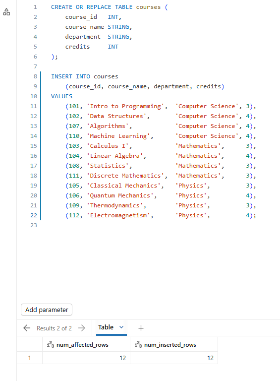
Figure 9: Executing the courses table creation script—Databricks AI/BI dashboards
3) Enrollments table
CREATE OR REPLACE TABLE enrollments (

    student_id  INT,

    course_id   INT,

    semester    STRING

);

INSERT INTO enrollments

    (student_id, course_id, semester)

VALUES

    (1, 101, 'Fall 2021'),   (1, 102, 'Spring 2022'),

    (1, 107, 'Fall 2022'),   (1, 103, 'Fall 2021'),    -- cross: Math

    (2, 101, 'Fall 2020'),   (2, 102, 'Spring 2021'),

    (2, 107, 'Fall 2021'),   (2, 110, 'Spring 2022'),

    (3, 103, 'Fall 2020'),   (3, 104, 'Spring 2021'),

    (3, 108, 'Fall 2021'),   (3, 101, 'Spring 2021'),  -- cross: CS

    (4, 101, 'Fall 2022'),   (4, 102, 'Spring 2023'),

    (4, 107, 'Fall 2023'),   (4, 110, 'Spring 2024'),

    (5, 103, 'Fall 2021'),   (5, 104, 'Spring 2022'),

    (5, 108, 'Fall 2022'),   (5, 105, 'Spring 2022'),  -- cross: Physics

    (6, 105, 'Fall 2020'),   (6, 106, 'Spring 2021'),

    (6, 109, 'Fall 2021'),   (6, 103, 'Fall 2020'),    -- cross: Math

    (7, 101, 'Fall 2023'),   (7, 102, 'Spring 2024'),

    (7, 107, 'Fall 2023'),

    (8, 101, 'Fall 2021'),   (8, 107, 'Spring 2022'),

    (8, 110, 'Fall 2022'),   (8, 104, 'Spring 2022'),  -- cross: Math

    (9, 103, 'Fall 2022'),   (9, 104, 'Spring 2023'),

    (9, 108, 'Fall 2023'),   (9, 111, 'Spring 2023'),

    (10, 105, 'Fall 2020'),  (10, 106, 'Spring 2021'),

    (10, 109, 'Fall 2021'),  (10, 104, 'Spring 2021'), -- cross: Math

    (11, 103, 'Fall 2021'),  (11, 104, 'Spring 2022'),

    (11, 108, 'Fall 2022'),  (11, 111, 'Spring 2022'),

    (12, 105, 'Fall 2022'),  (12, 106, 'Spring 2023'),

    (12, 109, 'Fall 2023'),  (12, 112, 'Spring 2023'),

    (13, 105, 'Fall 2021'),  (13, 106, 'Spring 2022'),

    (13, 109, 'Fall 2022'),  (13, 101, 'Spring 2022'), -- cross: CS

    (14, 101, 'Fall 2023'),  (14, 102, 'Spring 2024'),

    (14, 108, 'Fall 2023'),                             -- cross: Math

    (15, 101, 'Fall 2022'),  (15, 102, 'Spring 2023'),

    (15, 107, 'Spring 2023'),(15, 110, 'Fall 2023'),

    (16, 103, 'Fall 2023'),  (16, 104, 'Spring 2024'),

    (16, 108, 'Fall 2023'),

    (17, 105, 'Fall 2021'),  (17, 106, 'Spring 2022'),

    (17, 109, 'Fall 2022'),  (17, 112, 'Spring 2022'),

    (18, 101, 'Fall 2022'),  (18, 102, 'Spring 2023'),

    (18, 107, 'Fall 2023'),

    (19, 103, 'Fall 2020'),  (19, 104, 'Spring 2021'),

    (19, 108, 'Fall 2021'),  (19, 111, 'Spring 2021'),

    (20, 105, 'Fall 2023'),  (20, 106, 'Spring 2024'),

    (20, 109, 'Fall 2023');
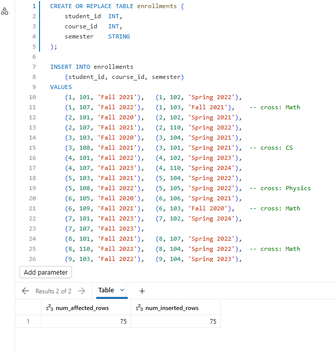
Figure 10: Executing the enrollments table creation script—Databricks AI/BI dashboards
4) Grades table
CREATE OR REPLACE TABLE grades (

    student_id  INT,

    course_id   INT,

    score       INT

);


INSERT INTO grades

    (student_id, course_id, score)

VALUES

    (1, 101, 88),  (1, 102, 92),  (1, 107, 85),  (1, 103, 74),

    (2, 101, 91),  (2, 102, 87),  (2, 107, 93),  (2, 110, 89),

    (3, 103, 97),  (3, 104, 95),  (3, 108, 92),  (3, 101, 88),

    (4, 101, 85),  (4, 102, 90),  (4, 107, 88),  (4, 110, 94),

    (5, 103, 78),  (5, 104, 82),  (5, 108, 76),  (5, 105, 71),

    (6, 105, 83),  (6, 106, 79),  (6, 109, 86),  (6, 103, 72),

    (7, 101, 62),  (7, 102, 70),  (7, 107, 65),

    (8, 101, 90),  (8, 107, 94),  (8, 110, 91),  (8, 104, 88),

    (9, 103, 86),  (9, 104, 89),  (9, 108, 93),  (9, 111, 91),

    (10, 105, 77), (10, 106, 81), (10, 109, 74), (10, 104, 83),

    (11, 103, 88), (11, 104, 91), (11, 108, 85), (11, 111, 87),

    (12, 105, 73), (12, 106, 68), (12, 109, 75), (12, 112, 70),

    (13, 105, 80), (13, 106, 84), (13, 109, 79), (13, 101, 77),

    (14, 101, 69), (14, 102, 73), (14, 108, 80),

    (15, 101, 95), (15, 102, 97), (15, 107, 96), (15, 110, 98),

    (16, 103, 71), (16, 104, 75), (16, 108, 68),

    (17, 105, 66), (17, 106, 70), (17, 109, 63), (17, 112, 67),

    (18, 101, 82), (18, 102, 86), (18, 107, 84),

    (19, 103, 90), (19, 104, 87), (19, 108, 84), (19, 111, 88),

    (20, 105, 58), (20, 106, 63), (20, 109, 55);
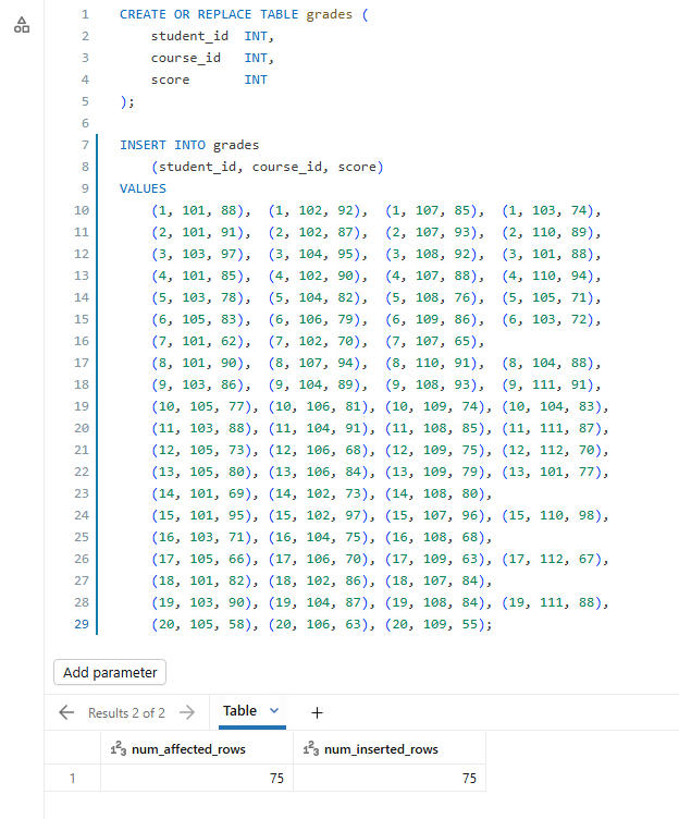
Figure 11: Executing the grades table creation script—Databricks AI/BI dashboards
Run all of this. You now have four tables ready. Check if everything landed correctly before moving on.
Step 6—(Optional) Add a dataset directly from Databricks Unity Catalog
If your data already lives in Unity Catalog as a table or view, you don’t need to write a query. Go to the Data tab in your dashboard and click Add data source. Choose the catalog, schema and table from the browser. Databricks surfaces all tables your account has SELECT access on.
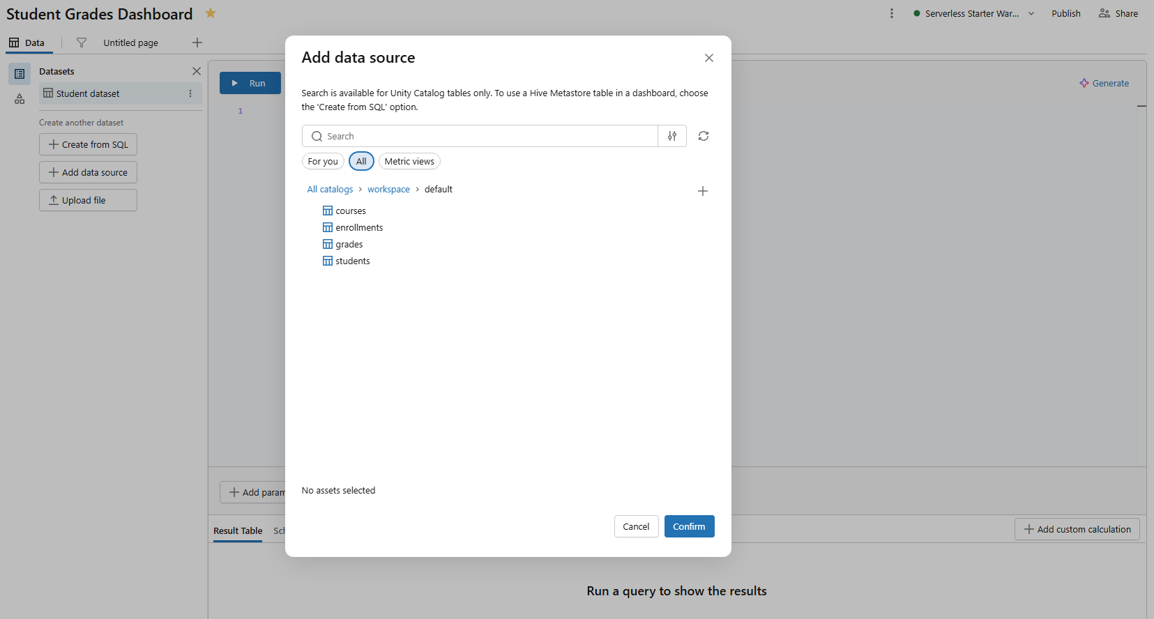
Figure 12: Selecting a catalog and schema to add a data source—Databricks AI/BI dashboards
This skips the SQL editor entirely and pulls the table’s column schema directly. You can still apply visualizations and filters on top of it.
Step 7—Define your analytical datasets
Go back to your Student Grades Dashboard and click the Data tab.
We will create five datasets here. For each one, click Create from SQL, write the query, run it to verify results, name the dataset and save it.
Tip: Databricks shows a blue icon with a bold title next to datasets actively used by canvas widgets and a gray icon next to unused ones.
Dataset 1 — Average score by department (name it dept_avg_grades)
SELECT

  s.department,

  ROUND(AVG(g.score), 1) AS avg_score,

  COUNT(DISTINCT s.student_id) AS student_count

FROM grades g

JOIN students s USING (student_id)

GROUP BY s.department

ORDER BY avg_score DESC;
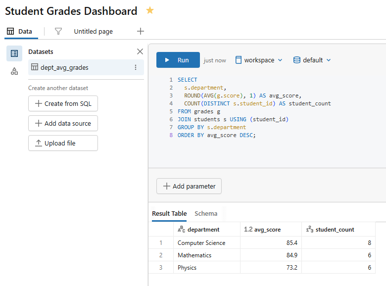
Figure 13: Query execution for the department average grades dataset—Databricks AI/BI dashboards
Dataset 2 — Per-course metrics (name it course_performance)
SELECT

  c.course_name,

  c.department,

  c.credits,

  ROUND(AVG(g.score), 1) AS avg_score,

  MIN(g.score) AS min_score,

  MAX(g.score) AS max_score,

  COUNT(*) AS total_enrollments

FROM grades g

JOIN courses c USING (course_id)

GROUP BY c.course_name, c.department, c.credits

ORDER BY avg_score DESC;
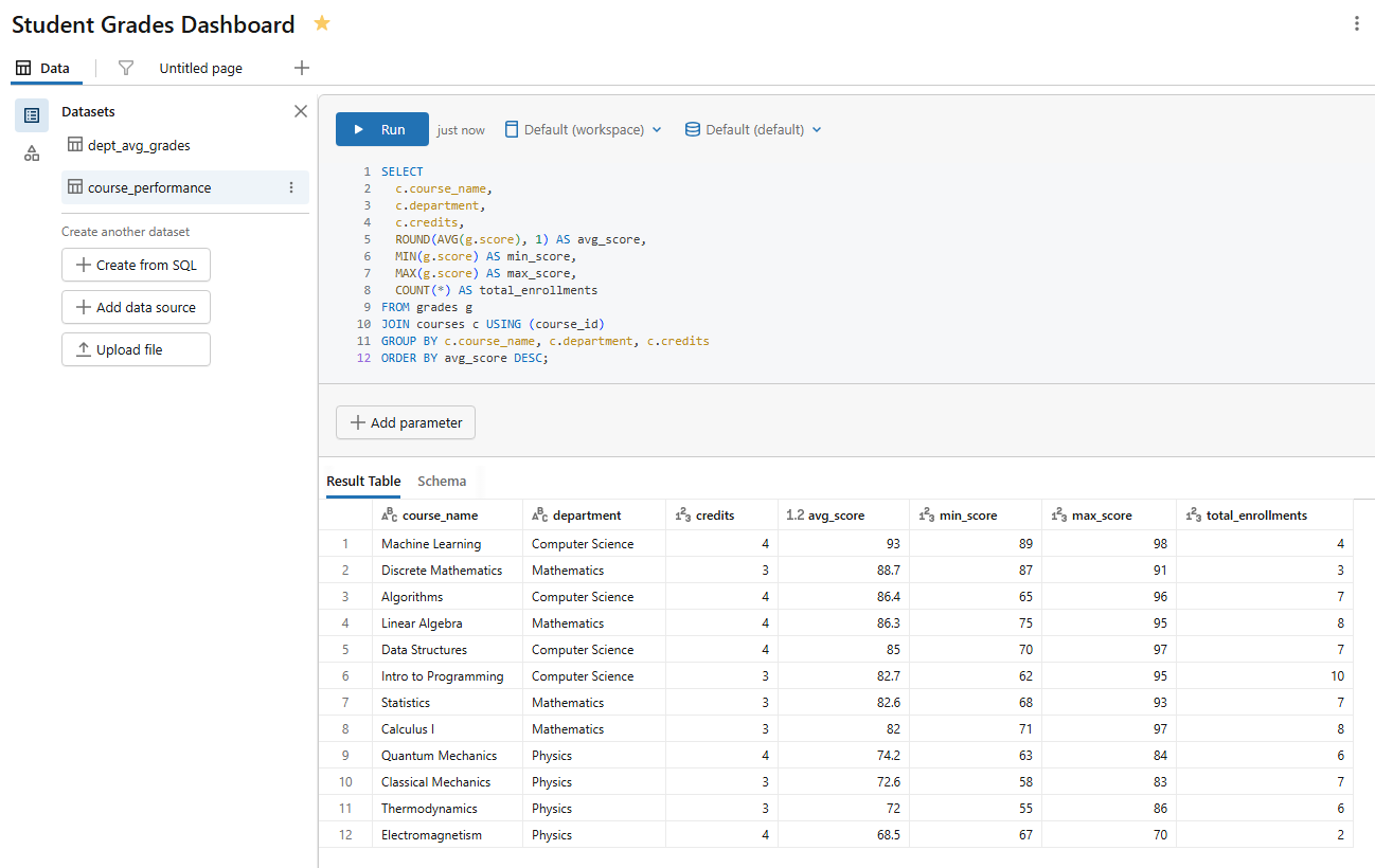
Figure 14: Query execution for the course performance dataset—Databricks AI/BI dashboards
Dataset 3 — Individual student detail (name it student_grades)
SELECT

  s.student_name,

  s.department,

  s.enrollment_year,

  c.course_name,

  c.credits,

  g.score,

  CASE

    WHEN g.score >= 90 THEN 'A'

    WHEN g.score >= 80 THEN 'B'

    WHEN g.score >= 70 THEN 'C'

    WHEN g.score >= 60 THEN 'D'

    ELSE 'F'

  END AS grade_letter

FROM grades g

JOIN students s USING (student_id)

JOIN courses c USING (course_id);
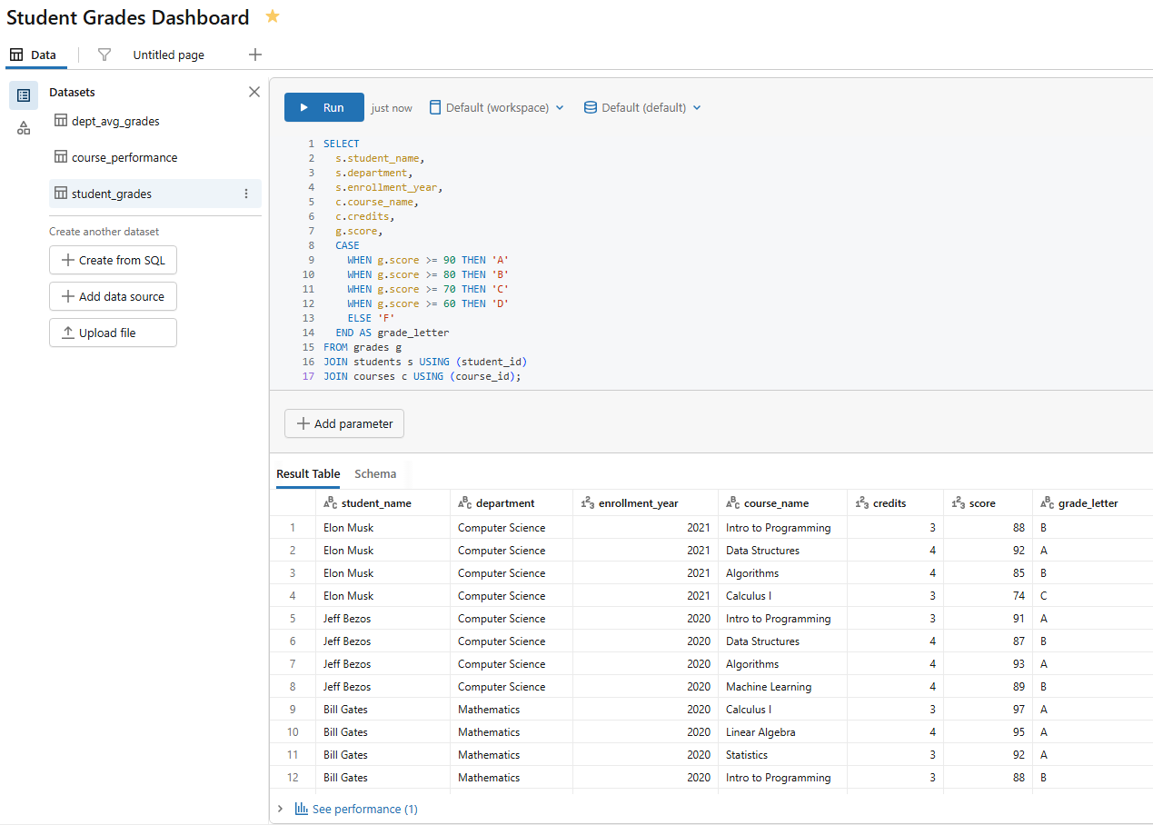
Figure 15: Query execution for the student grades dataset—Databricks AI/BI dashboards
Dataset 4 — Enrollment trend by semester (name it enrollment_semester)
SELECT

  semester,

  s.department,

  COUNT(*) AS enrollment_count

FROM enrollments e

JOIN students s USING (student_id)

GROUP BY semester, s.department

ORDER BY semester;
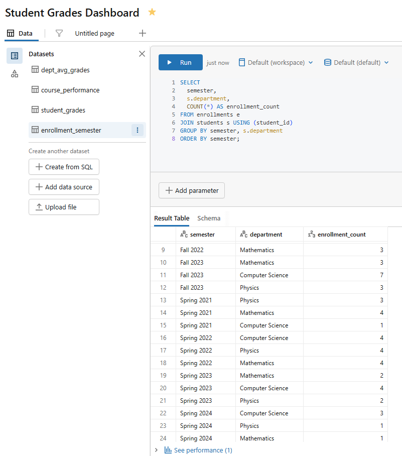
Figure 16: Query execution for the enrollment semester dataset—Databricks AI/BI dashboards
Dataset 5 — Grade distribution heatmap (name it dept_grade_heatmap)
The heatmap chart expects a single numeric value per X/Y cell combination, so pre-aggregate here.
SELECT

  s.department,

  CASE

    WHEN g.score >= 90 THEN 'A'

    WHEN g.score >= 80 THEN 'B'

    WHEN g.score >= 70 THEN 'C'

    WHEN g.score >= 60 THEN 'D'

    ELSE 'F'

  END AS grade_letter,

  COUNT(*) AS student_count

FROM grades g

JOIN students s USING (student_id)

GROUP BY s.department, grade_letter

ORDER BY s.department, grade_letter;
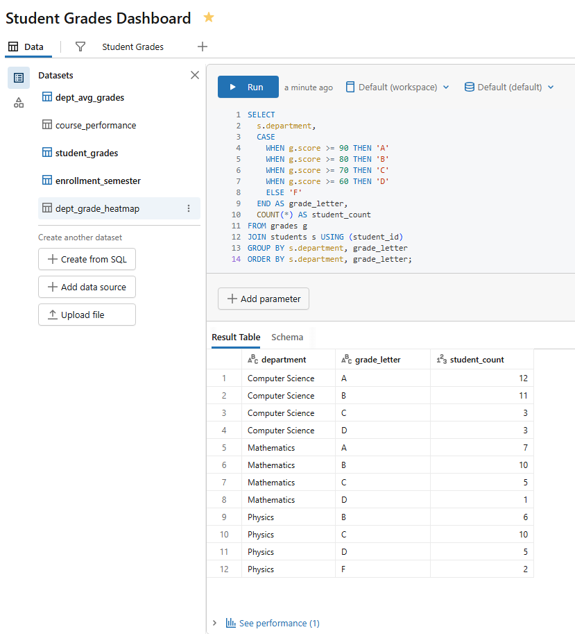
Figure 17: Query execution for the department grade heatmap dataset—Databricks AI/BI dashboards
Run each query before saving to confirm it returns results. A dataset that errors at definition time won’t load on the canvas either.
Step 8—Create your first visualization (Bar chart)
Switch to the Canvas tab. Click Add a visualization (the + button in the center of the blank dashboard canvas or in the toolbar). A new visualization widget appears, and the Visualization Configuration panel opens on the right.
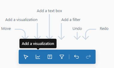
Figure 18: The visualization configuration panel on a blank canvas—Databricks AI/BI dashboards
Configure it:
- Dataset: dept_avg_grades
- Visualization type: Bar chart
- X axis: department
- Y axis: avg_score
- Color: department (optional, but helps differentiation)
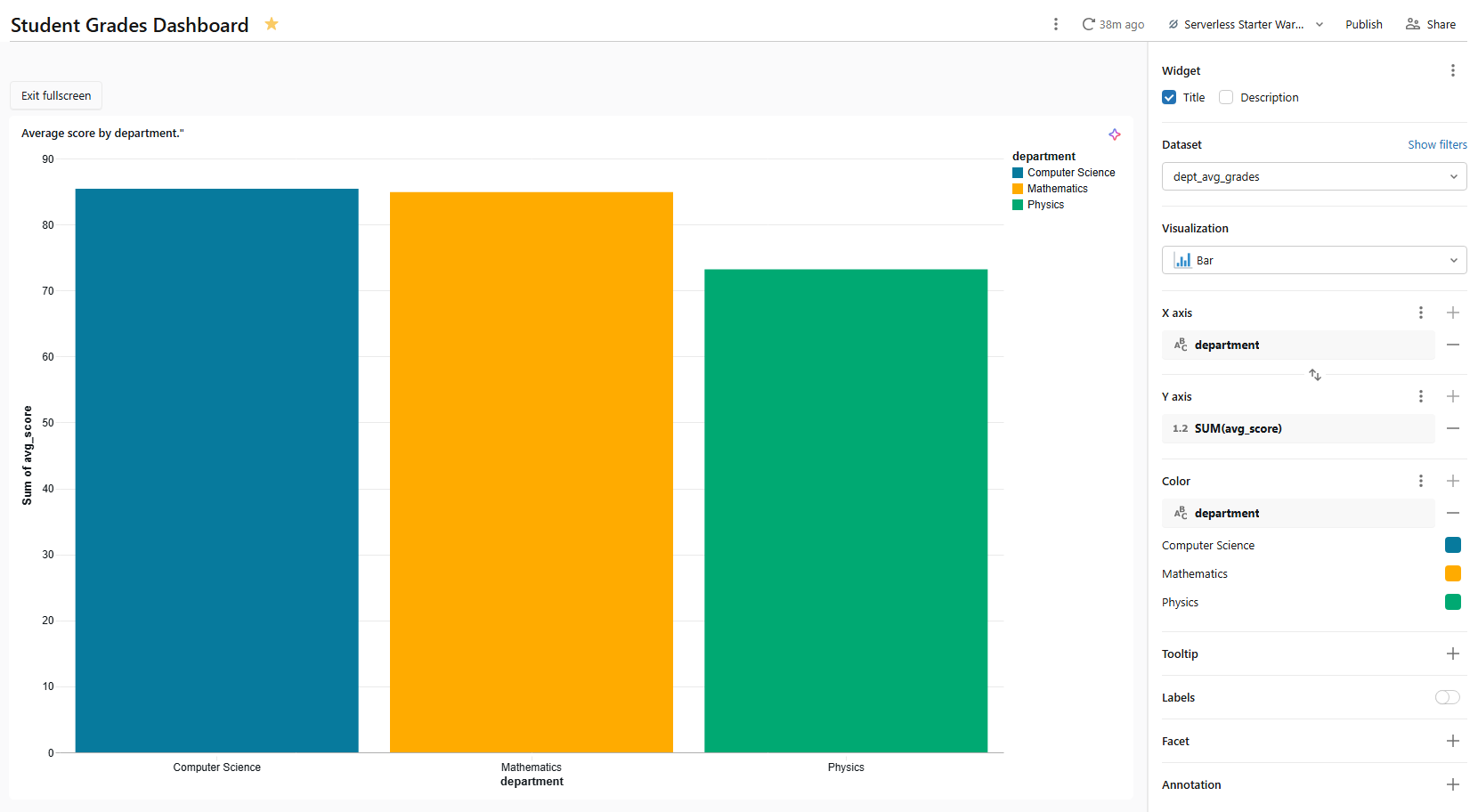
Figure 19: Configuring the bar chart axes—Databricks AI/BI dashboards
Name the widget Average score by department using the title field at the top of the configuration panel.
This bar chart will serve as a cross-filter source. When someone clicks a bar, all other visualizations on the same page that use dept_avg_grades filter to that department automatically.
Step 9—Add additional visualizations
Let’s build out the canvas with a range of chart types. Repeat the “Add a visualization” flow for each chart below.
1) Line chart ⇒ enrollment trend over time
- Dataset: enrollment_semester
- Visualization type: Line chart
- X axis: semester
- Y axis: enrollment_count
- Color: department
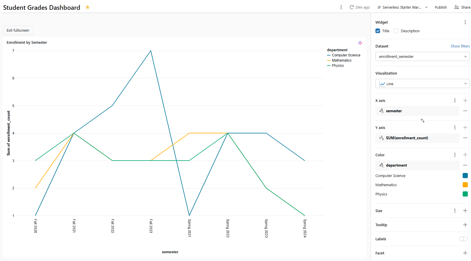
Figure 20: Line chart configuration for enrollment trends—Databricks AI/BI dashboards
Name Enrollment trend by semester. The color encoding breaks enrollment count into one line per department, making cross-semester trends easy to compare.
2) Pie chart ⇒ grade letter distribution
- Dataset: student_grades
- Visualization type: Pie chart
- Angle: COUNT(*) (select COUNT as the aggregation measure from the measure picker. The angle field controls slice size proportionally)
- Color: grade_letter
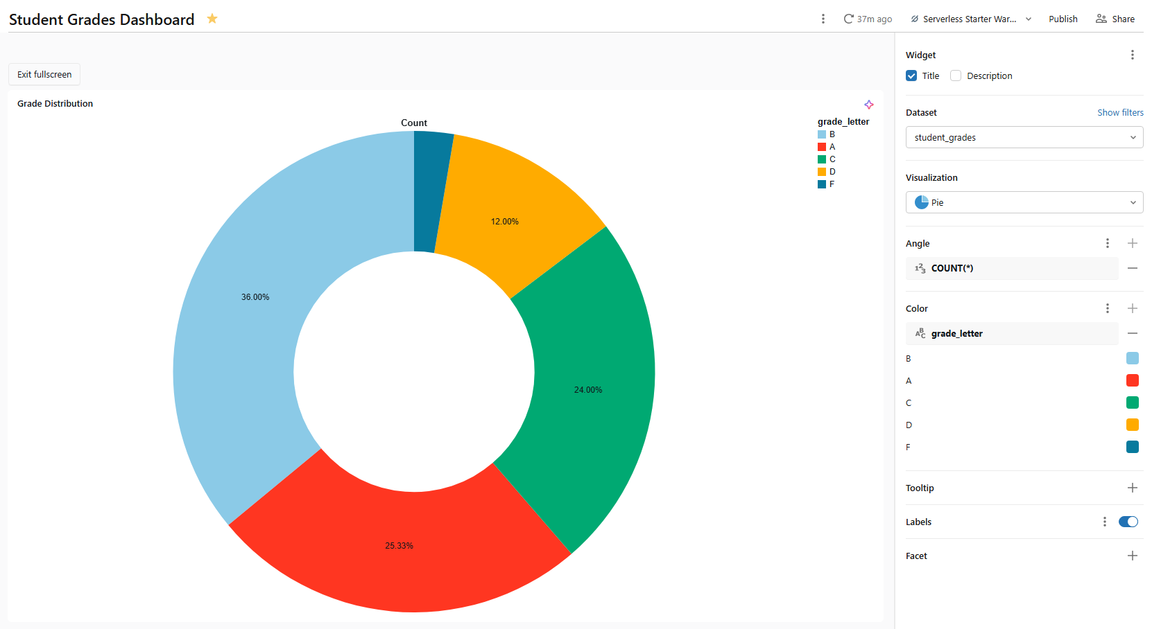
Figure 21: Pie chart setup showing grade letter distribution—Databricks AI/BI dashboards
3) Box chart ⇒ score distribution by department
The box chart plots the statistical distribution of a numeric field (min, first quartile, median, third quartile and max), optionally grouped by category. It is a compact way to compare spread across departments.
- Dataset: student_grades
- Visualization type: Box chart
- X axis: department
- Y axis: score
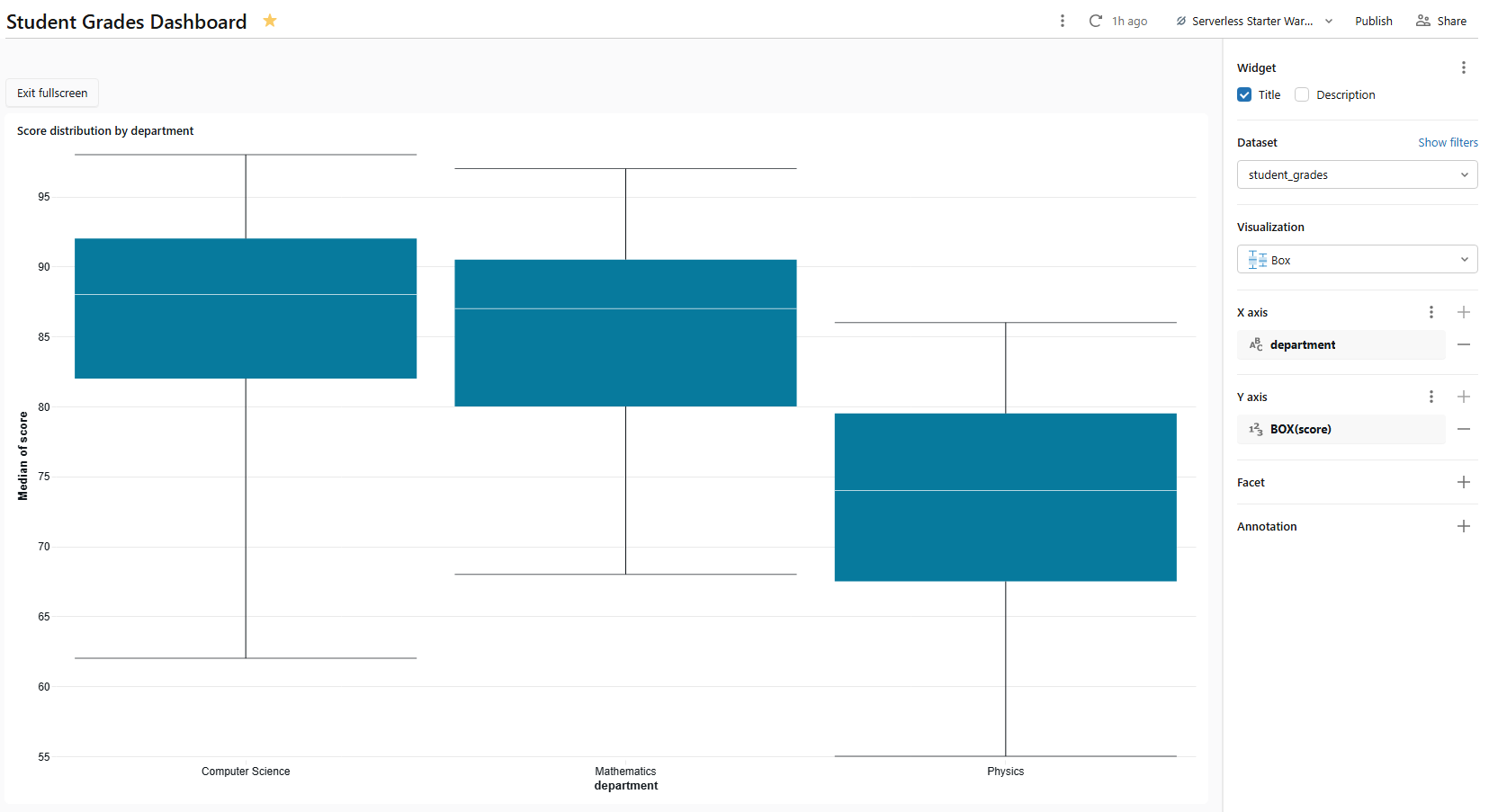
Figure 22: Box chart plotting score distribution—Databricks AI/BI dashboards
Name it Score distribution by department. Databricks computes the quartiles from the raw score values in the dataset; no pre-aggregation needed. Box charts support cross-filtering: clicking a box filters other charts on the same page that share student_grades.
4) Bubble chart ⇒ course metrics by enrollment and difficulty
A bubble chart is a scatter chart with a third dimension encoded as point size. In Databricks AI/BI dashboards, you create one by adding a field to the Size setting of a scatter chart.
- Dataset: course_performance
- Visualization type: Scatter
- X axis: avg_score
- Y axis: total_enrollments
- Size: credits (this converts the scatter into a bubble chart; larger bubbles represent higher-credit courses)
- Colour: department
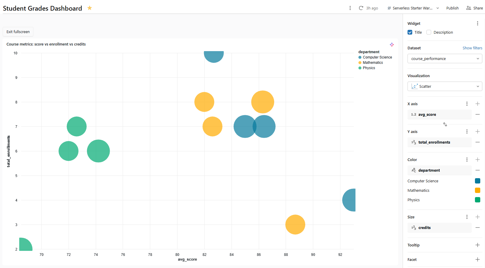
Figure 23: Bubble chart mapping course metrics—Databricks AI/BI dashboards
Name it something like Course metrics: score vs enrollment vs credits. Each bubble represents one course. Its horizontal position shows average score, vertical position shows enrollment count and size shows credit hours. Because bubble charts are scatter charts under the hood, they support cross-filtering.
5) Histogram chart ⇒ score frequency distribution
A histogram shows how often values fall into numerical ranges (bins). Use it to spot score clustering or outliers across the whole dataset.
- Dataset: student_grades
- Visualization type: Histogram
- X axis: score
- Bins: Leave at the default (Databricks auto-selects bin count) or set a custom bin width (10 points works well for a 0–100 score scale)
- Y axis: COUNT(*)
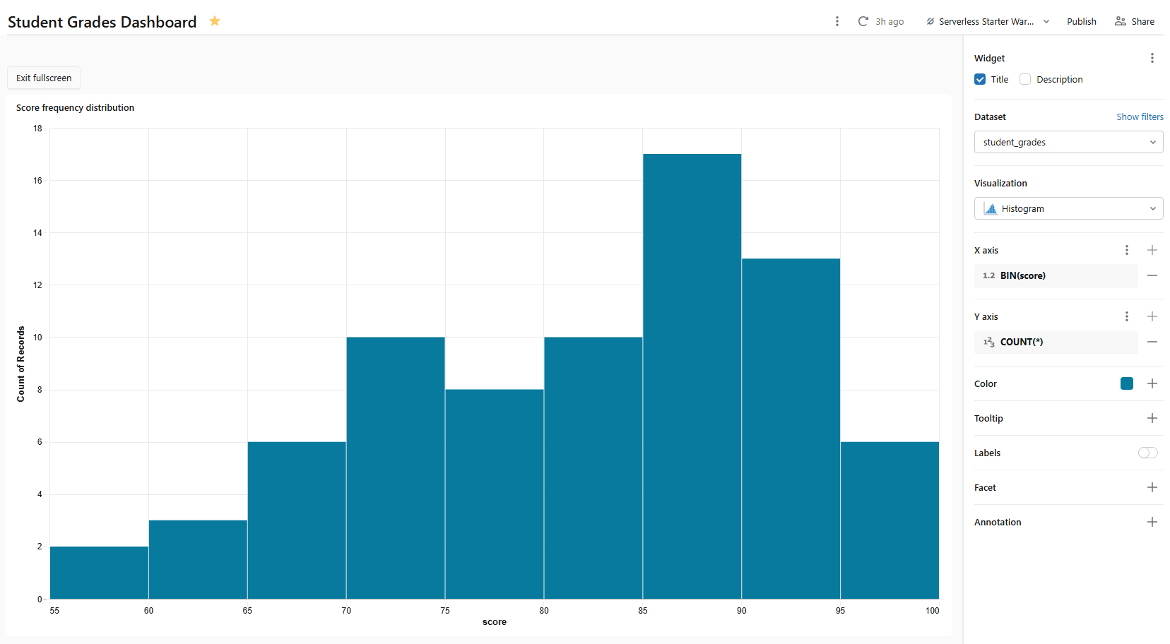
Figure 24: Histogram configuration for score frequencies—Databricks AI/BI dashboards
Name it Score frequency distribution. Since student_grades contain one row per student-course pair, the histogram plots distribution across all scored assessments. Histograms support cross-filtering.
Step 10—Add a KPI (counter) widget
At the top of many dashboards, you often see big counters for key metrics (KPIs). Databricks AI/BI dashboards have counter visualizations for this. To add one, click on Add a new visualization widget to the canvas and set:
- Dataset: dept_avg_grades
- Visualization type: Counter
- Value: student_count with aggregation set to SUM
Figure 25: Counter widget configuration for total students—Databricks AI/BI dashboards
For an overall average score counter, create a separate single-row dataset or use a static calculation. Here is one cleaner approach; add a second counter widget using this inline query as a new dataset named overall_metrics:
SELECT

  COUNT(DISTINCT student_id) AS total_students,

  COUNT(DISTINCT course_id)  AS total_courses,

  ROUND(AVG(score), 1)       AS overall_avg_score

FROM grades;
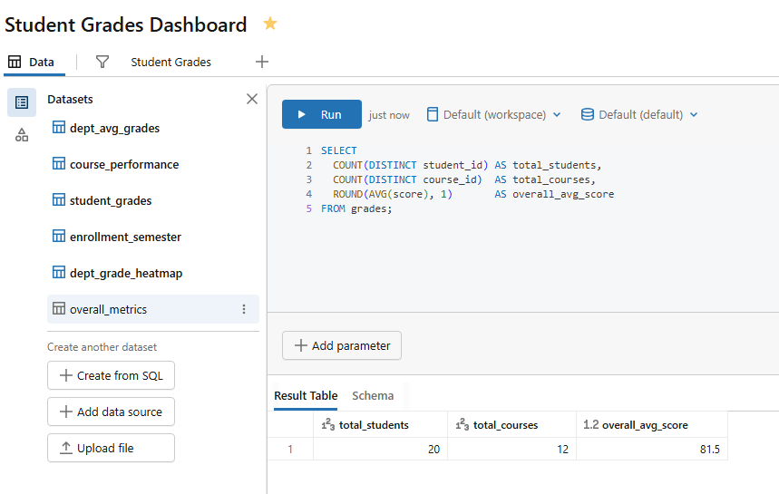
Figure 26: SQL editor showing the overall metrics query—Databricks AI/BI dashboards
Then configure three separate counter widgets from overall_metrics:
- Counter 1 ⇒ Value = total_students, label = Total students
- Counter 2 ⇒ Value = total_courses, label = Total courses
- Counter 3 ⇒ Value = overall_avg_score, label = Overall average score
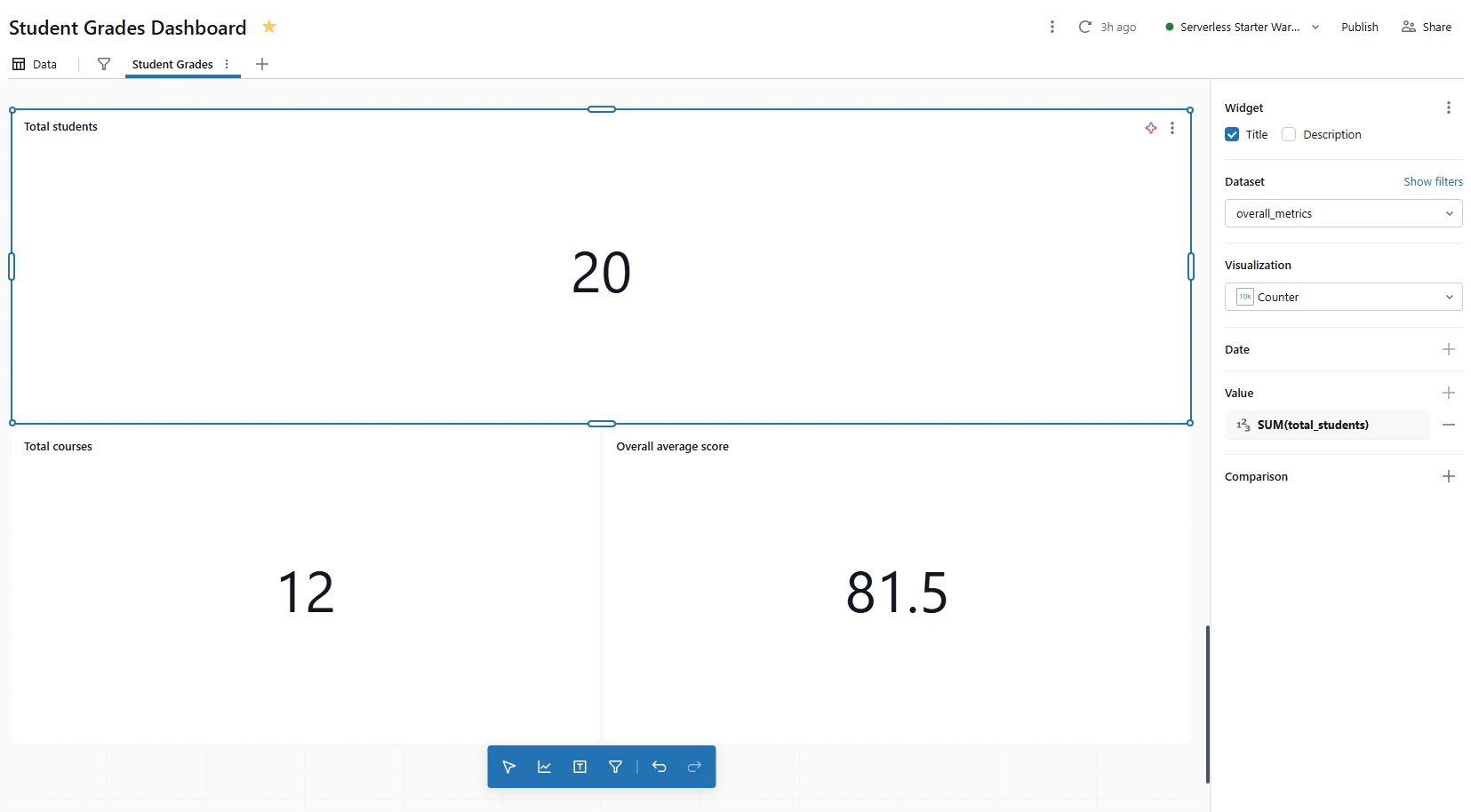
Figure 27: Three configured KPI counters displaying high-level metrics—Databricks AI/BI dashboards
Step 11—Add interactive filter Databricks widgets
Filters let viewers narrow the dashboard data without touching the SQL. There are two kinds:
- field filters (which let users pick values from a dimension column)
- parameter filters (which inject user-selected values directly into a dataset’s SQL query using a {{parameter_name}} token.
These filters are a powerful form of dynamic filtering that keeps your dashboards responsive and easy to use.
For most use cases, field filters are simpler. Let’s add three.
1) Department filter (field filter)
Click Add a filter on the canvas. In the filter configuration panel on the right.
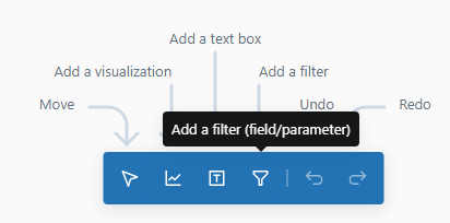
Figure 28: Adding a filter widget to the dashboard canvas—Databricks AI/BI dashboards
Filter type: Single/Multiple values
Fields: student_grades.department
Title: “Department“
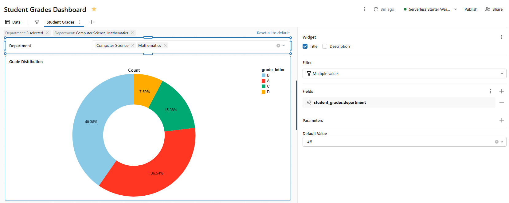
Figure 29: Configuring a single-value dropdown filter for departments—Databricks AI/BI dashboards
This filter will apply to any visualization on the page that uses student_grades. Visualizations using other datasets (like dept_avg_grades) will not be affected unless you explicitly add a mapping to those datasets in the filter config.
To make a filter control multiple datasets, click Add dataset in the filter configuration panel and map the same department field from dept_avg_grades, course_performance and dept_grade_heatmap. Now one dropdown controls all visualizations at once.
2) Score range filter (range slider)
Let’s add one final filter:
- Filter type: Range slider
- Fields: student_grades.scores
- Title: “Score range”
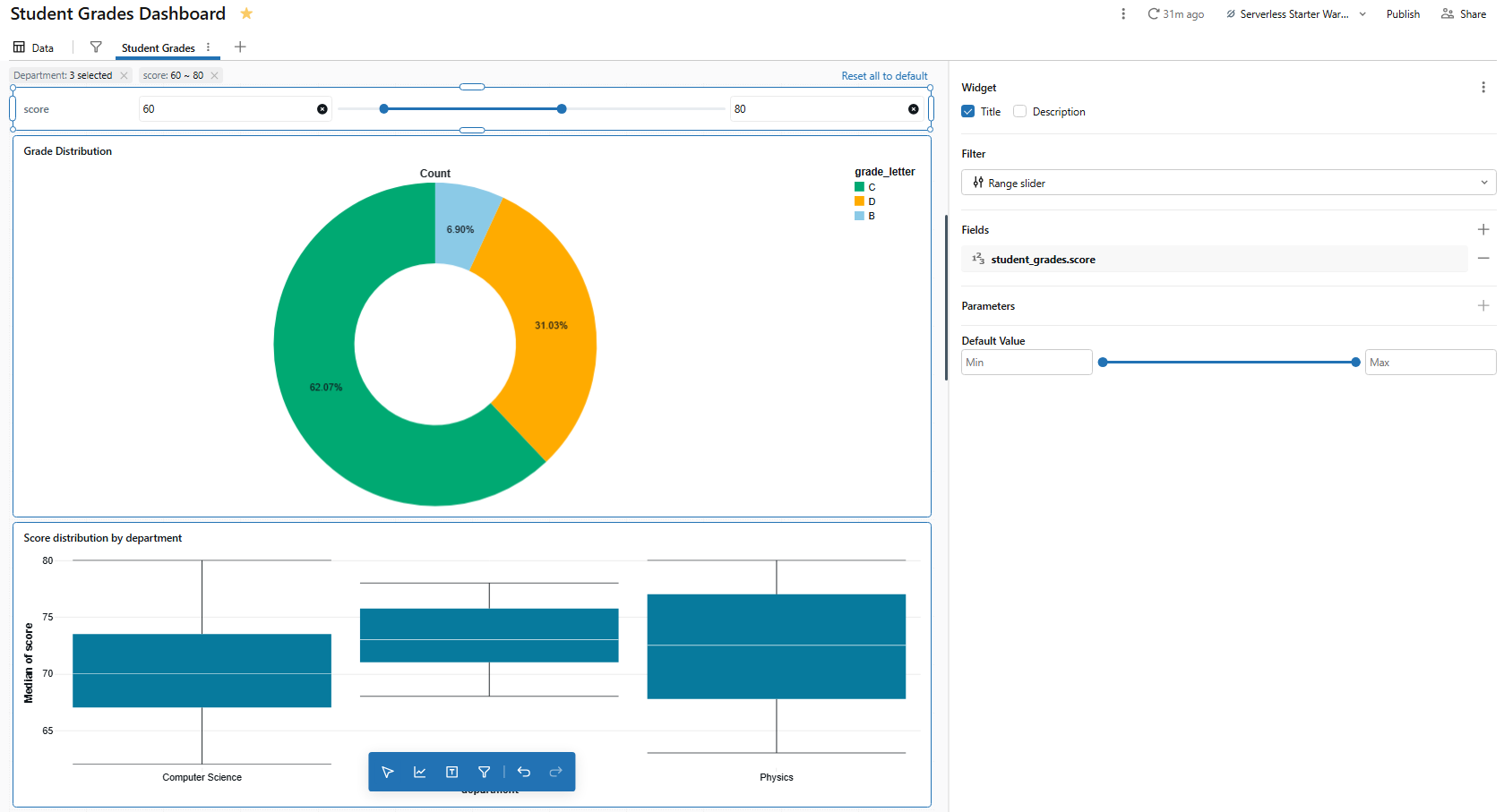
Figure 30: Setting up a range slider filter for scores—Databricks AI/BI dashboards
The range slider lets viewers drag a min/max range to filter charts that use student_grades. It is particularly useful for narrowing the histogram or box chart to a specific score band.
Canvas vs global filter panel
Filters placed on the canvas are page specific. Filters added to the Global filters panel (accessed via the filter icon in the dashboard toolbar) apply across all pages. For our department filter, that is a suitable candidate to move to the global panel since department is a cross-cutting dimension.
To move a filter, use the right-click context menu or keyboard shortcuts (Cmd/Ctrl + X to cut, then right-click an empty space in the global panel and select Paste).
Step 12—Enable cross-filtering between charts
Here is something that often surprises people coming from legacy Databricks SQL dashboards. Cross-filtering requires no configuration. Click a bar, pie chart slice, heatmap cell, histogram bin or scatter chart point, and Databricks automatically filters all other visualizations on the same page that use the same dataset.
Cross-filtering currently works on bar charts, scatter charts, bubble charts, heatmaps, pie charts, histograms and point maps. To select multiple data points at once, hold Shift and click additional marks, or use Cmd+Shift (macOS) or Ctrl+Shift (Windows/Linux).
Say if you click on the “Computer Science” bar in the Score distribution by department chart, it filters the Grade distribution pie chart and the Score frequency distribution histogram chart all at once. It is because they all share a dataset that includes department as a dimension.
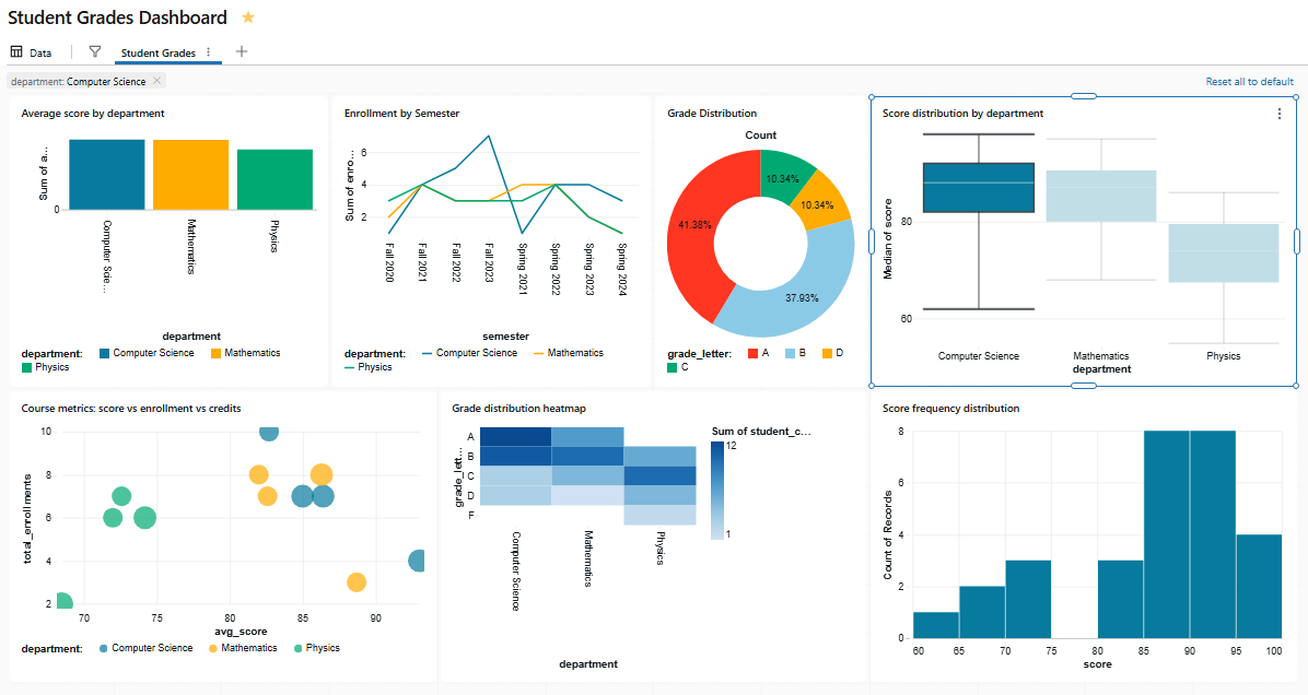
Figure 31: The grade distribution and Score frequency distribution reacting to a cross-filter—Databricks AI/BI dashboards
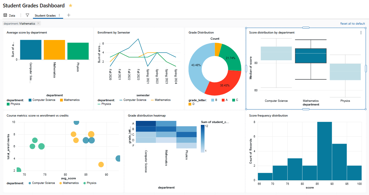
Figure 32: The grade distribution and Score frequency distribution reacting to a cross-filter—Databricks AI/BI dashboards
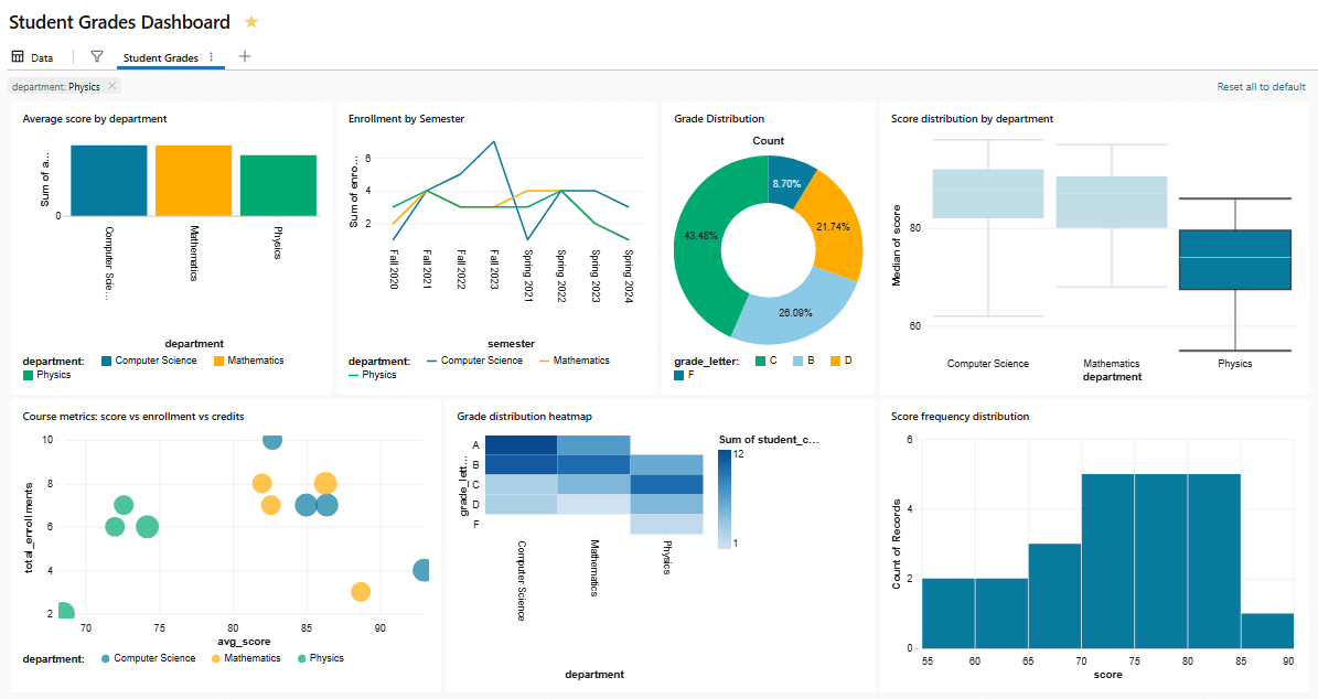
Figure 33: The grade distribution and Score frequency distribution reacting to a cross-filter—Databricks AI/BI dashboards
When cross-filtering is active, the active filter bar at the top of the page shows all currently active selections, including global filters, page-level filters and cross-filters.
Tip: Cross-filtering only works across charts on the same page that share the same dataset. If two charts use different datasets, clicking one will not filter the other; even if those datasets join on the same underlying tables. For cross-dataset filtering, use explicit filter widgets mapped to multiple datasets instead.
Step 13—Create a Second Databricks AI/BI Dashboard page
Now we will use a second page for student-level details. That way, the first page stays at the department and course level, and viewers can drill down to individual records on page 2.
In the Canvas tab, look for the + button at the top of the page tabs. A new blank page should appear.
Name the new page Student detail by double-clicking the page tab.
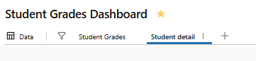
Figure 34: Renaming a new dashboard page tab—Databricks AI/BI dashboards
On this page, add a visualization using the student_grades dataset:
- Visualization type: Table
- Columns: student_name, department, course_name, credits, score, grade_letter
Name the widget Student grade detail.
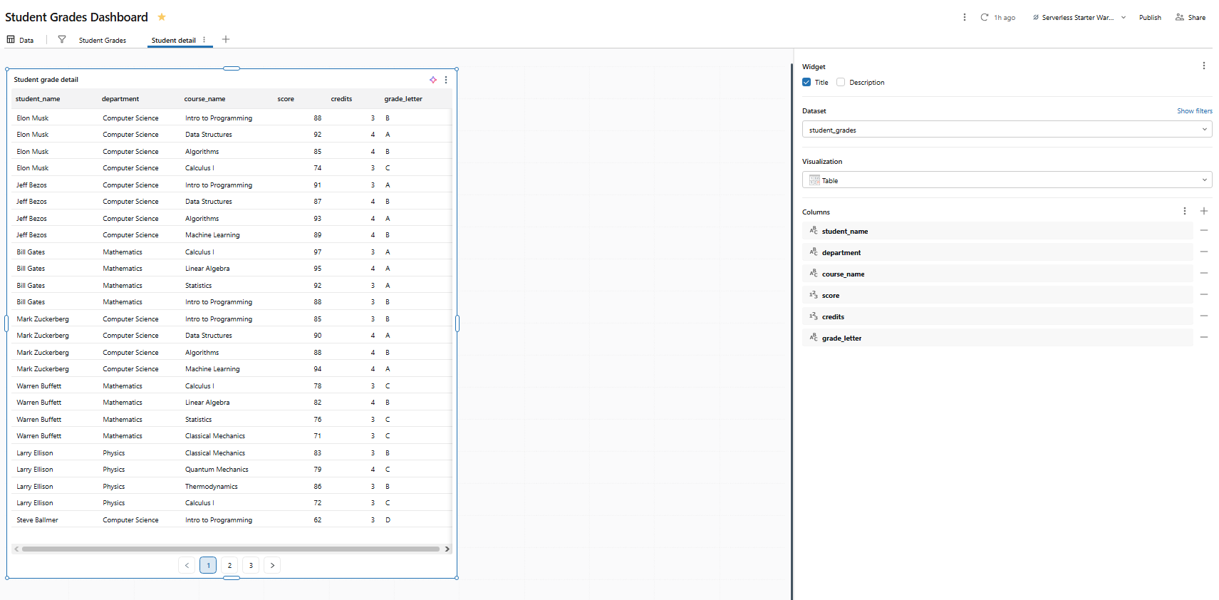
Figure 35: Table visualization showing student grade details—Databricks AI/BI dashboards
Add a second bar chart on this page:
- Dataset: student_grades
- Visualization type: Bar chart
- X axis: student_name
- Y axis: score
- Color: grade_letter
Name it Score by student.
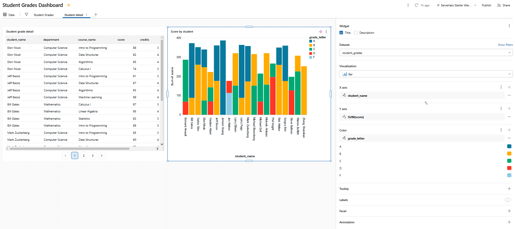
Figure 36: Bar chart displaying individual student scores—Databricks AI/BI dashboards
Step 14—Configure drill-through navigation
Drill-through lets viewers right-click a data point on page 1 and navigate to page 2 with data already filtered to that selection.
To do so, right-click a box in the Score distribution by department chart on page 1. If page 2 contains at least one visualization that uses a dataset with a department column, you will see Drill to > Student detail in the context menu. Selecting it opens page 2 and pre-filters all visualizations on that page (based on shared dataset fields) to the selected department.
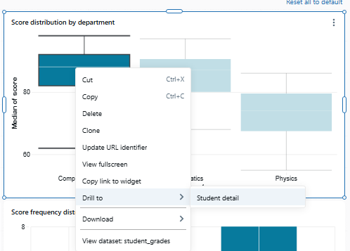
Figure 37: The right-click context menu showing the drill-through option—Databricks AI/BI dashboards
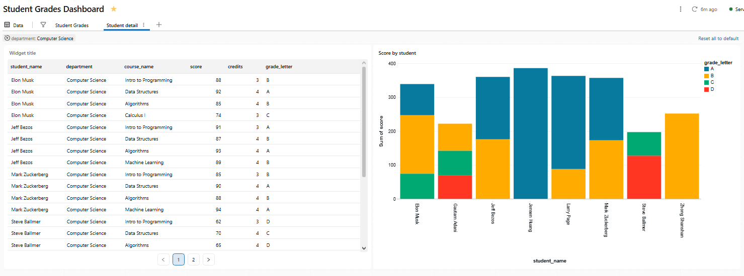
Figure 38: The destination page filtered by the drill-through selection—Databricks AI/BI dashboards
There is nothing to explicitly configure for basic drill-through. Databricks detects that page 1 and page 2 share a dataset field and automatically wires the drill action.
Step 15—Add an AI forecasting widget
The AI forecast feature uses Databricks’ AI_FORECAST() SQL function to project a trend line forward from historical data. It is currently in public preview and requires a line chart with a temporal X axis and a numeric Y axis.
Let’s add a forecast to the Enrollment trend by semester line chart on page 1.
With the enrollment trend chart selected, look for the + Forecast button in the visualization editor panel on the right. Click on it, then select Forecast.
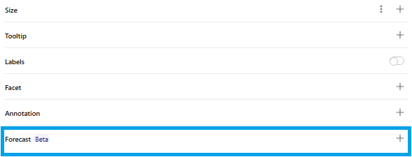
Figure 39: The visualization editor panel showing the forecast button—Databricks AI/BI dashboards
Databricks generates a chart that overlays a forecasted trend line on top of the historical data. The projection is based on the selected data range and aggregation logic from your underlying dataset. Each series gets a continuation line with a shaded confidence interval.
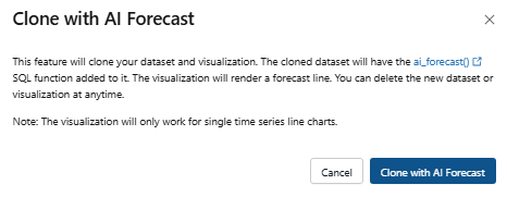
Figure 40: Clone with AI Forecast dialog box—Databricks AI/BI dashboards
Step 16—Add a pivot table for distribution analysis
Pivot tables aggregate data into a cross-tabular display: rows on one axis, columns on another and a computed metric in each cell.
Add a visualization to the Student detail page:
- Dataset: student_grades
- Visualization type: Pivot table
- Rows: student_name
- Columns: course_name
- Values: score with aggregation AVG
Name the widget Student-course score matrix.
Figure 41: Pivot table configuration for student and course scores—Databricks AI/BI dashboards
A few things to know about pivot tables in Databricks AI/BI dashboards:
- Pivot tables support backend aggregation, so they handle datasets larger than 64,000 rows without truncation
- Column headers can be sorted alphabetically from the header context menu
- Conditional formatting is available per column for highlighting high or low values
- Row and column totals are calculated in the backend, so they are accurate even when the displayed data is large
- Drill-through is available directly from pivot table cells (added in 2026)
- Cross-filtering is now supported from pivot tables (added in 2026)
Step 17—Add text (markdown) Databricks widgets for context
Text widgets let you annotate your dashboard with headings, descriptions, images or links. They render a subset of Markdown.
Click Add a text box from the canvas toolbar (or the widget menu). A text editor opens.
For the top of page 1, add:
## Student Grades Dashboard

Student Grades dashboard analyzes grade performance across departments and courses.

Click any bar or cell to cross-filter the page. Right-click to drill through to student-level detail.
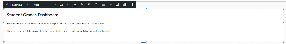
Figure 42: Markdown text editor for dashboard annotations—Databricks AI/BI dashboards
For the top of page 2 (Student detail):
## Student detail

Student detail dashboard page shows individual student performance.
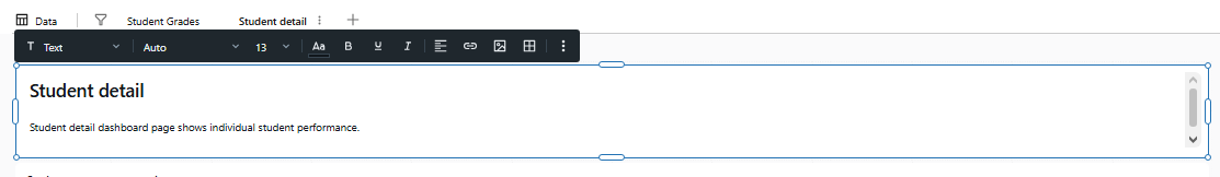
Figure 43: Rendered markdown text on the second dashboard page—Databricks AI/BI dashboards
Step 18—Preview and test the Databricks AI/BI Dashboard
Now that all Databricks widgets are in place, play with the dashboard as a viewer. Adjust the department filter and confirm all chart updates. Click on bars or pie chart slices and watch cross-filtering in action. Navigate to page 2 via drill-through and confirm filters carried over. Make sure all charts resize and align well on the dashboard canvas.
Step 19—Publish the Databricks AI/BI Dashboard
When the dashboard looks right, click Publish in the top toolbar.
The publish dialog asks for permission:
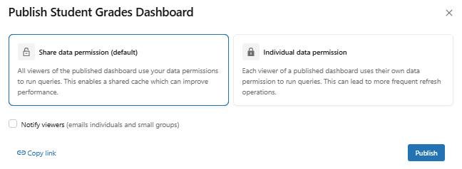
Figure 44: The publish dialog asking for credential preferences—Databricks AI/BI dashboards
1) Embedded credentials (shared data permissions)
The dashboard runs queries as the publishing user. Viewers do not need their own warehouse access or Databricks Unity Catalog privileges. Anyone you share the dashboard with sees data through the publisher’s credentials. Use this for read-only consumer dashboards where you control the data access centrally.
2) Individual credentials
Each viewer runs queries under their own credentials. They need CAN USE access on the warehouse and SELECT access on the underlying tables. Use this when row-level security in Databricks Unity Catalog should restrict what different viewers see.
After you select the credential model and publish, the Share button appears in the toolbar. Click it to open the sharing dialog. You can share with:
- All workspace users or groups
- All account-level users
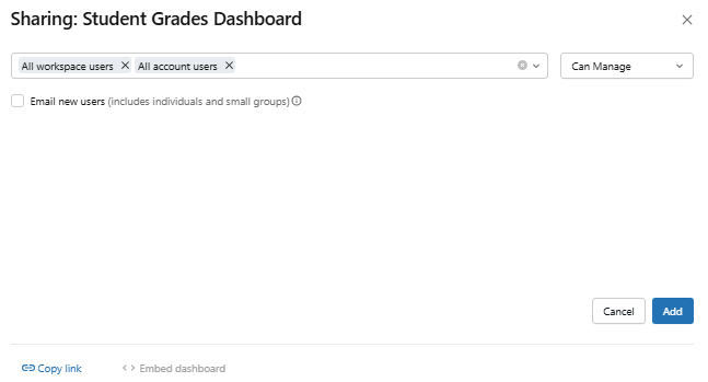
Figure 45: The sharing dialog for configuring viewer access—Databricks AI/BI dashboards
Step 20—(Optional) Automate and version-control the dashboard
Databricks AI/BI dashboards integrate with Databricks Git folders (currently in public preview). Placing a dashboard inside a Git folder gives you commit history, feature branches and pull request workflows.
To start tracking a dashboard with Git, move or create it inside an existing Databricks Git folder. Click the kebab menu in the upper-right corner of the dashboard editor and select Commit to Git.
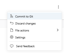
Figure 46: The context menu option to commit the dashboard to Git—Databricks AI/BI dashboards
Choose a folder already linked to a Git repository (or create one if you do not have one).
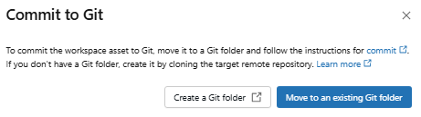
Figure 47: Selecting the target Git folder for version control—Databricks AI/BI dashboards
Most Git operations require CAN MANAGE permission on the dashboard. Dashboards are serialized as .lvdash.json files. One real-world limitation: the serialized format is verbose and generates large diffs that are hard to review in pull requests. Databricks is working on this, but it is a known pain point today. Also note: the maximum is 100 dashboards per Git folder, and Git-based job references (jobs pointing to a Git URL) do not work with dashboards; you need to reference them by workspace path or ID instead.
You now have a multi page dashboard with cross-filtering, drill-through, an AI forecast overlay, a pivot table and version control. That covers the core interactive patterns Databricks AI/BI dashboards support today.
A few things worth experimenting with from here:
Databricks Assistant for authoring. From the dashboard canvas, you can describe a chart in natural language and let the assistant generate it. It works for most chart types except tables and pivot tables. It is useful for rapid prototyping, though you will often want to refine the output manually.
Figure 48: Generating a chart using the Databricks Assistant—Databricks AI/BI dashboards
Metric views. If you find yourself defining the same KPIs across multiple dashboards, look into Databricks Unity Catalog metric views. They let you define business metrics once and reference them consistently across dashboards and Databricks Genie spaces.
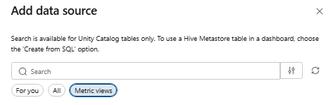
Figure 49: Databricks Unity Catalog metric view—Databricks AI/BI dashboards
Databricks Genie spaces. If your viewers need to go beyond what the dashboard shows, attach a Databricks Genie Space to your dashboard. Viewers can click “Ask Genie” and ask natural language questions against the same data. Companion Databricks Genie spaces now use Agent mode, which enables multi-step reasoning for complex questions.
Figure 50: Interacting with a linked Databricks Genie space—Databricks AI/BI dashboards
Embedding. Published dashboards can be embedded in external web apps using iframe embedding as part of an embedded analytics strategy. The “Ask Genie” button is also available in embedded contexts for dashboards that have a linked Databricks Genie space.
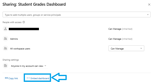
Figure 51: Embedding Databricks AI/BI dashboards
Conclusion
And that’s a wrap! Databricks AI/BI dashboards are now the only dashboard option available. The legacy Databricks SQL dashboards are gone for good. AI/BI dashboards put interactive power right at your fingertips, right where your data lives. You can filter visuals instantly and apply cross-filtering with ease. AI helps you build and explore your data, and sharing results with your team has never been simpler.
Databricks AI/BI dashboards are a major upgrade from the old legacy Databricks SQL dashboards. They offer faster performance and seamless end-to-end Lakehouse integration. They also include advanced AI features like Databricks Genie assistance and automated forecasting. So, whether you are a data analyst, a BI analyst or a business user, you can now create a complete business intelligence solution directly within Databricks. Define governed datasets, build charts, link multiple pages for drill-down analysis and even engage in conversations with your data using “Ask Genie.”
In this article, we have covered:
- What Databricks AI/BI is
- What a Databricks AI/BI dashboard is
- Core features and capabilities of Databricks AI/BI dashboards
- Databricks AI/BI dashboards vs legacy Databricks SQL dashboards
- How to create interactive data visualization in Databricks AI/BI dashboards step by step
… and so much more!
Try it in your Databricks Workspace today.
Want to learn more? Reach out for a chat
FAQs
What is Databricks AI/BI Dashboard?
A Databricks AI/BI dashboard is an interactive business intelligence dashboard built and published inside a Databricks workspace. It connects directly to data in the Databricks Lakehouse, supports multi page layouts, AI-assisted authoring, cross-filtering, drill-through and a broad library of data visualization types. No separate BI license is required.
Is Databricks AI/BI Dashboard the same as legacy Databricks SQL dashboards?
No. AI/BI dashboards are the next-generation dashboards. The old Databricks SQL dashboards were retired as legacy dashboards and are no longer accessible. AI/BI dashboards have a new UI, better performance, a draft/publish workflow, AI assistance and richer features like cross-filtering, drill-through and Databricks Genie.
Are legacy Databricks SQL dashboards still available?
No. Legacy dashboards and their APIs are no longer accessible as of early 2026. Databricks removed direct access. Migrate any existing dashboards to AI/BI using the clone/migration tool.
What is the difference between Databricks AI/BI dashboards and Databricks AI/BI Genie?
Databricks AI/BI dashboards are for building visual reports (charts, tables). Databricks Genie (and Genie spaces) is a natural-language AI assistant that answers questions. Mainly, you use Databricks Genie to ask data questions or even to build dashboards from prompts, while dashboards display the visual summaries. They work with each other.
Do I need Databricks Unity Catalog to use Databricks AI/BI dashboards?
Not strictly, but Databricks Unity Catalog adds significant value. You can use AI/BI dashboards without it by querying non-Unity Catalog tables, but Unity Catalog enables fine-grained governance, metric views and semantic metadata. If you use Unity Catalog tables as sources, your workspace must be UC-enabled and you need SELECT privileges on those tables.
Can I build a dashboard from a SQL query?
Yes. In the Data tab, click Create from SQL and write your SELECT statement. The query result becomes the dataset for the dashboard. This is often the easiest approach: write the SQL to get exactly the fields you want, then build charts on top.
Do Databricks AI/BI dashboards require an additional license or paid add-on?
No. Dashboards are included with Databricks SQL. There is no extra BI license needed; just the normal Databricks usage costs (compute and storage). Viewers with the Consumer access entitlement can access published dashboards without the full SQL entitlement.
Can I use a Databricks Unity Catalog table or view directly as a dataset?
Yes. On the Data tab, use Add data source and pick the UC table or view. Databricks pulls in the column schema directly. For metric views, it pulls in all defined fields and measures from that view automatically.
What is the difference between a filter and a parameter?
A field filter applies after the query runs, filtering the result set. A parameter is a placeholder injected into your SQL query before it runs, using a {{parameter_name}} token in the dataset SQL. Parameters are more flexible for things like dynamic filtering with dynamic date truncation or user-driven SQL logic, but field filters are simpler for most use cases.
How does AI Forecast work, and what are its limitations?
AI Forecast uses the Databricks AI_FORECAST() SQL function to project future values based on historical trends. It works on line charts with a time axis. Click + Forecast on a supported line chart and dashboards generate a projected trend line beyond your data with a shaded confidence interval. It is currently in public preview, requires a time series (numeric Y over time X) and works best on reasonably long, clean series. The model is selected automatically.
What is cross-filtering in an AI/BI dashboard?
Cross-filtering is a within-page interaction. When a viewer clicks a data point in one chart, all other charts on the same page that use the same dataset update to show only data matching that selection. It requires no configuration: just click. Active cross-filters appear in the filter bar at the top of the page alongside any active global or page-level filters.
Which chart types are supported in Databricks AI/BI dashboards?
A wide variety. You have standard ones (bar chart, column, line chart, area chart, pie chart, donut chart, scatter chart) and more advanced ones like histograms, box charts, Sankey charts, heatmaps, maps (point maps and choropleth maps), waterfall charts and the KPI counter widget. There are also table and pivot table visualizations for grid data. Anything you would expect in a modern BI tool is there, plus some Databricks-specific ones.
Can I use metric views with Databricks AI/BI dashboards?
Yes. You can select a metric view as a data source on the Data tab. When you do, the dashboard includes the metrics exactly as defined. You cannot filter out parts of a metric view (it comes in as-is), but you can add additional custom calculations. Also, you can reference a metric view in your SQL query dataset and filter or join it as needed.
Can I share a dashboard with people outside the workspace?
Yes, two ways. First, published dashboards can be shared with any account-level user, who sees the published dashboard via the Databricks account URL without needing workspace access. Second, you can embed a dashboard externally using an iframe as part of an embedded analytics setup. External embedding requires basic embedding to be enabled in workspace admin settings.
Can I embed Databricks AI/BI dashboards in another app or website?
Yes. Published dashboards can be embedded via an iframe. Just get the public or shared link and use an <iframe src=”…”> in your web page. Note that the embedded view will respect the permissions you set (shared data vs viewer data) and for AI features like “Ask Genie,” there are some limitations on external embedding.
Can I export and import dashboards between workspaces?
aYes. In the UI, open the dashboard and go to File > Export to download its JSON (.lvdash.json). Import that file into another workspace via File > Replace Dashboard on a draft. You can also use the Databricks REST API import/export endpoints or integrate with Git.
Can I manage dashboards with APIs or Git?
Yes. Databricks provides a dedicated Dashboards API (Lakeview API) for dashboards. Call GET, PATCH and POST on 2.0/lakeview/dashboards to list, create, update or delete dashboards programmatically. You can also put your dashboard in a Git-tracked folder for version control, or export the JSON and commit it to your own repository manually.
Do published dashboards include Databricks Genie space automatically?
Yes, by default. When you publish, the Enable Databricks Genie toggle is on by default and Databricks automatically generates a companion Databricks Genie Space based on your dashboard datasets and visualizations. You can link to an existing Genie space instead or turn the toggle off. The companion Genie space does not appear in your file browser or the Genie listing page; it is managed from the dashboard settings.
Is version control supported for Databricks AI/BI dashboards?
Yes. Databricks has Git integration for dashboards. Put your dashboards in a Databricks Git folder and every change is tracked like code. If Git folders are not available in your setup, you can manually export the dashboard as JSON and check it into Git, then import back when needed.
Can Databricks AI/BI dashboards be programmatically created and managed via API?
Yes. The Databricks REST API includes endpoints for AI/BI dashboards (the Lakeview Dashboards API). Use POST to create a new dashboard, PATCH to update it and POST to the /published endpoint to publish it. The same API supports import/export, permissions and scheduling.